- General Information
- Getting Started
- Trouble Shooting
- Intermediate Level Graphs
- Advanced Level Graphs
- Some How To's
- Programmers Corner (For those who want to do something a bit out the
ordinary)
- Version History
Introduction
For a long time now we have been wanting a tool which
easily allows us to draw graphs in our Clarion programs. Our ideal tool
should have both a strong drawing engine and a template for linking the
graph to the data in the dictionary. Up to now, however, none of the tools
provided were sufficiently capable on the template side of making adding a
graph to our applications simple.
This is a pity, because a graph is an incredibly powerful way of managing
large clumps of data. Many browse windows can be enhanced with a simple
graph, and it's much easier to spot trends and anomalies on a graph than
on a plain browse screen or report.
Late in 1999 a Clarion programmer (we'll call him "The programmer formerly
known as Mike") showed us a really nice engine written entirely in
Clarion. We encouraged him to complete the job by writing the necessary
template. He asked us to do it, and of course we can't resist a challenge.
After rather more work than we expected, the template is now here.
Actually, we quite like it - it contains some features never before
implemented in a Clarion Template, including a
Dynamic
User Interface (i.e. the template makes fewer options available
to a beginner than to an advanced user).
We think you'll find that the power of this template truly does make
adding graphs to your applications simple, with no hand-coding required.
Rather than listing all the features here, though, we refer you to the
section entitled
Features.
Because we've broken new ground in the way some aspects of the template
work, we've also had a large number of bug reports where the "bug" is
actually a feature. So, before you report a bug, please read
One
Man's Bug is Another Man's feature.
Upgrading to Insight Graphing 2.15 or later?
Upgrading from Insight Graphing Version
2.00 to 2.14
There are a small number of issues that might affect
your application if you are upgrading from Insight 2 (before 2.74) to
build 2.74 or later. these issues are documented here. For upgrading
from Insight Graphing 1 please read the next section.
- Your application may have a Global Variable called iColor of type
iColorGroupType. This type has been deprecated and this global
variable should be removed from the global variables section of the
data pad.
- Legacy apps need "Enable the use of ABC Classes" turned on. In
Multi-DLL systems do this in the Data DLL, the EXE and any app with
an Insight graph in it.
Upgrading from Insight Graphing Version 1
What you get in the upgrade?
- New Graph-Jumpstart makes adding a new graph to your app easier.
- No more black box DLL. Insight ships as source, which means you
get the full power of getting into the classes at a low level, and
you can upgrade your Clarion without waiting for a compiled DLL
from us.
- Now that Insight ships as source, you get the full power of Draw
(the Insight Graphing 1 DLL used an old version of Draw) in your
graphs.
- Anti-Aliasing support - gives you smooth edging in your graphs.
- Curve Drawing - Draws an interpolated curves through all points
in the data set. The curve passes through each data point.
- Number of built-in Data styles extended from 12 to 31
How do you upgrade?
- If you are a licensed Insight Graphing 1 user, you need to
purchase an upgrade from www.clarionshop.com
- If you do not own a copy of Draw, you will need to purchase a
copy when you upgrade. You'll get a substantial discount on Draw
when you purchase the upgrade.
What do you need to change in your application after you've upgraded
- C7 and C8 users will probably need to remove the c70ig.lib (or
claig.lib) from their projects. The Clarion7/8 IDE sometimes does
not remove old projected libs that were added by a previous
version of a template.
- Add Draw to your application (Data DLL and applications using
Insight Graphing)
If you're getting compile errors after upgrading
- In Clarion 8, you need to upgrade to the latest version of Draw
(at least 3.11)
- You must add the Draw global extension template to your
application.
Upgrading from Insight 1 Beta 6 (or
earlier)
Every effort has been made to make sure that
upgrading from beta 6 to beta 7 (or later) goes as smoothly as possible.
There are however some cases where your manual intervention is required.
If you have been referred here by the generated code then check the
Reference Number next to each point to see which item applies to you.
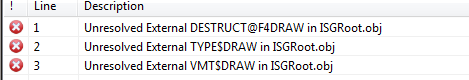
| Reference 1 |
Reports: Up to beta 6 the "control" used on
the report has been the 'box' control. This allows you to put a
border around your graph. From beta 7 onwards there also needs
to be an image control. Your options are:
a) remove the Insight Graph and repopulate it (a lot of work) OR
b) make the following manual change to the report format:
-
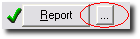
Go to the Report Procedure in the application tree, and
bring up the text version of
the report structure by clicking on the ellipsis button
next to the report button.
- Find your graph control. It will be a BOX control, and the
#ORIG setting should be #ORIG(?Insight). Just after this
line add another line to create an IMAGE control. Note that
the SEQ setting should be set the
same, and the AT of the control
should be set the same.
The Image control will need a unique USE
equate. By convention just tack the word Draw onto the Box's
equate. Example :
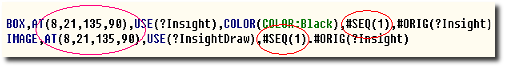
Note : This change will have no
affect on your ability to go back to Insight Beta 6 if
necessary. i.e. the image control will remain, but the old
version of Insight will simply ignore it. |
Support
Your questions, comments and suggestions are welcome.
You can contact us in one of the following ways.
| CapeSoft Support |
| Email |
 |
| Telephone |
+27 87 828 0123 |
License & Copyright
This template is copyright © 2000-2025 by CapeSoft.
None of the included files may be distributed (except where noted in the
Distribution section.) Your programs which use Insight can be distributed
without any Insight royalties.
Each developer needs his own license to use Insight Graphing (need to
buy more licenses?).
This product is provided as-is. CapeSoft Software and CapeSoft Electronics
(collectively trading as CapeSoft), their employees and dealers explicitly
accept no liability for any loss or damages which may occur from using
this package. Use of this package constitutes agreement with this license.
This package is used entirely at your own risk.
Use of this product implies your acceptance of this, along with the
recognition of the copyright stated above. In no way will CapeSoft , their
employees or affiliates be liable in any way for any damages or business
losses you may incur as a direct or indirect result of using this product.
For the full EULA see
https://capesoft.com/eula.html
Distribution
You only need to ship the LIBPNG.DLL
and ZLIB.DLL files with your application.
Installation
1. Run the supplied installation file.
Features
Graphing Engine
- Support for Bar, Pareto, Line, Gantt, Time, Donut, Hi-Lo, Candle and
Pie Charts
- Full control over the look and feel of the graph, and the data
- 20 built-in Axis styles, 12 built-in Data Styles
- Automatic Y-Axis Scaling
- Multiple Y-Axis Labeling
- Supports Data-Point Labeling
Template
- Dynamic Interface, exposes more options as you learn.
- Directly interfaces to the tables in your Dictionary
- Supports the Graphing of Fields or Expressions
- Supports the Counting, Summing, and Averaging of records
- Supports dynamic labeling based on the data in your tables
- Uses Views for efficient access to the
data, regardless of the File Driver
- Supports plotting data from Queues and Memory Variables as well
- Supports Multiple Views per graph, and Multiple Fields per View
- Supports dynamic (changing) numbers of data sets
- Supports drilling down from one graph to another based on the point
clicked on in the first graph
Graphing on Windows
- Allows Graphs on all Windows including Browses, Forms etc.
- Allows multiple graphs on the same window
- Allows for Mouse-Over information
- Allows for a Right-Click menu including options like Zoom In, Zoom
Out, Print, Save As, Drill Down, Back Up, Select Graph Type and so on.
- Allows for a default Left-Click action to be set
Graphing on Reports
- Allows automatic placement of Graphs at the beginning or end of the
report
- Allows placement of graphs during the report, based on your criteria
- Allows graphs to be added to existing reports
- Allows graphs to be placed next to or above each other
- Allows multiple graphs on one detail
General
- No Hand-Coding required
- Allows you to set the "look" of your graphs from one global
extension, but also allows you to override the look for every
individual graph
- Supports Legacy and ABC templates
- Supports EXE and DLL apps
- Supports 32 bit (not 16 bit) programs
One Man's Bug is another Man's Feature
- Look Up Fields: All bug reports are
welcome at support@capesoft.com However there is one "bug" which has
been reported numerous times, but which is in fact a feature. However,
because Insight behaves differently to what you might expect, it can
appear to be a bug at first glance. This bug centers around the use of
the ... button to look up fields. When you click on
this and select a field, you probably expect the old contents of the
entry to be cleared and the selected field to be put in its place.
With Insight this doesn't happen. This is because Insight allows you
to build expressions into almost all these fields. For example, say
you wanted to sum all the sales for a particular month. Your key, on
the Invoice file, is naturally by Date. But you want to sum on the
Month, not the Date, so the Parent field would be set to Month(Inv:Date).
By the way: If you reported this bug and were directed to read this
bit of the docs, don't feel bad. You're not alone <grin>.
- Legends: Another often-reported bug is
simply something we don't support. When making legends you have 3
choices to make:
- Legend position ( where it is in relation to the graph)
- Legend type (Stacked or Inline)
- Font Angle (0 or 90 degrees)
There are two combinations of the above that we don't support, because
they simply are not useful. If either of these two combinations is set,
the legend is will not be displayed. They are:
- Position Left or Right (4 or 6), Inline = 1 and Font Angle = 0
- Position Top or Bottom (8 or 2), Inline = 1 and Font Angle = 90
Both of these legend combinations would essentially leave no space for the
graph itself.
Tip: A good place to experiment with the legend properties is in the
included
school example. Click on the Grand Tour button on the toolbar and
keep clicking next until you reach the legends example.
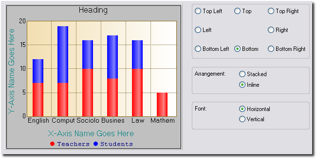
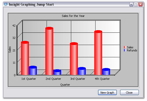
A Bit of Background
Like all things, it helps to understand a little bit
of the terminology used in the template before you get going. Probably the
best way to start is with a diagram:
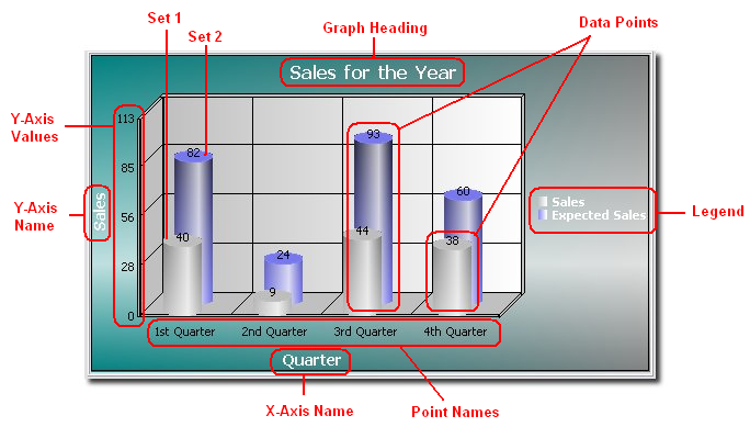
- Graph Heading: The heading of the graph.
In this case, "Sales for the Year".
- X-Axis Name: The name of the x-axis. In
this case, "Quarter".
- Y-Axis Name: The Name of the y-axis. In
this case, "Sales".
- Y-Axis Values: These are the values next
to the y-axis. In this case they are 0, 27, 55, 82, 109.
- Data Points: Each bar on the chart above
is a (data-) point. In general, "data points" refers to the actual
points plotted on the graph.
- Set: A set is a collection of data
points. In the above graph, there are two sets, each drawn in a
different color. So, in this example, the first set consists of all
the data points drawn in gray, and the second consists of all the data
points drawn in blue.
- Legend: The legend appears to the right of
this graph. It lists the color of each set next to its description.
- Point Numbers: These are the x-axis
values. One can also see the point numbers as the x-coordinates of the
data points. Usually, what appears as labels beneath the x-axis are
not the point numbers, but the point names (note that it is possible
to use the former as labels), since these are usually more
informative. See below.
- Point Names: The point names usually
appear below the x-axis. A point name is a (very) short description
for a point number. In this case the point names are "1st Quarter",
"2nd Quarter", "3rd Quarter" and "4th Quarter".
As you work through the various template options you'll see these words,
especially Data Points, Sets and Point Names, a lot. Feel free to refer to
the above diagram until you are comfortable with the terms.
Jump Start
In this section we give a step-by-step example that
will guide you through creating your first application containing an
Insight Graph.
What we are doing: Our aim is to create a
simple window containing a graph control that will refresh every time new
data is loaded. Our end-result will look something like this:
(1) Open Clarion 8, and create a new application. Add the Active Insight
Functions Global Extension. In the
Template
Level dropdown list, choose Advanced. Click OK.
(2) For the main procedure, create a generic window and add a close
button. Add to the local data of this procedure the following fields
(leave the window formatter, right-click on the Main procedure, choose
Data, click Insert):
plottingQueue queue
setNumber
long
setName string(128)
pointNumber long
pointName string(
128)
value real
end
Give the above queue the prefix "
pq".
(3) Go to the window, go to Populate Control Template and add an
Insight_Graph Control Template to your window. Resize the region it
creates to fit the window, and then right-click on the region and choose
Actions. Enter your Graph Heading on the
Graph
tab ('
Sales for the Year' -
Tip:
Note that for Insight Graphing, every
string
that is not a variable must be included in
single
quotes).
(4) Now choose the
Data
Tab and click on Insert. On the
Primary
Source Tab of the window that pops up, select Queue from the Data
From dropdown list. Select plottingQueue from the Local Data for the Queue
Name. Now choose the
Sets
Tab and click on Insert. On the
Set
Tab of the new window that pops up, enter
pq:setName
as the Set Description. For High Field, choose
pq:value.
Now go to the
Advanced
Tab of this window, check Override Setnumber and select
pq:setNumber
for the value. Click OK and OK again.
(5) Now go to the
X-Axis
Tab and enter the X-axis Name ('
Quarter').
Uncheck Automatically Generate. For Point Name, enter
pq:pointName,
and for Point Number select
pq:pointNumber.
(6) Next, go to the
Y-Axis
Tab and enter a name for the Y-axis ('
Sales').
(7) Now click on the
Legend
Tab and check Override Global Settings, check Display Legend and
choose Right in the Position group.
(8) Go to the ThisWindow.Init Procedure embed, just after
GlobalErrors.SetProcedureName('
Main'),
and paste the following code:
PlottingQueue.setNumber = 1
PlottingQueue.setName = 'Sales'
PlottingQueue.pointNumber = 1
PlottingQueue.pointName = '1st Quarter'
PlottingQueue.value = random(1,100)
add(
PlottingQueue)
PlottingQueue.setNumber = 1
PlottingQueue.setName = 'Sales'
PlottingQueue.pointNumber = 2
PlottingQueue.pointName = '2nd Quarter'
PlottingQueue.value = random(1,100)
add(
PlottingQueue)
PlottingQueue.setNumber = 1
PlottingQueue.setName = 'Sales'
PlottingQueue.pointNumber = 3
PlottingQueue.pointName = '3rd Quarter'
PlottingQueue.value = random(1,100)
add(
PlottingQueue)
PlottingQueue.setNumber = 1
PlottingQueue.setName = 'Sales'
PlottingQueue.pointNumber = 4
PlottingQueue.pointName = '4th Quarter'
PlottingQueue.value = random(1,100)
add(
PlottingQueue)
PlottingQueue.setNumber = 2
PlottingQueue.setName = 'Refunds'
PlottingQueue.pointNumber = 1
PlottingQueue.pointName = '1st Quarter'
PlottingQueue.value = random(1,10)
add(
PlottingQueue)
PlottingQueue.setNumber = 2
PlottingQueue.setName = 'Refunds'
PlottingQueue.pointNumber = 2
PlottingQueue.pointName = '2nd Quarter'
PlottingQueue.value = random(1,10)
add(
PlottingQueue)
PlottingQueue.setNumber = 2
PlottingQueue.setName = 'Refunds'
PlottingQueue.pointNumber = 3
PlottingQueue.pointName = '3rd Quarter'
PlottingQueue.value = random(1,10)
add(
PlottingQueue)
PlottingQueue.setNumber = 2
PlottingQueue.setName = 'Refunds'
PlottingQueue.pointNumber = 4
PlottingQueue.pointName = '4th Quarter'
PlottingQueue.value = random(1,10)
add(
PlottingQueue)
(9) Now add a button called ?NewGraph to the window, and in the
EVENT:Accepted embed, paste the above code again, but preceded by
free(
PlottingQueue) and succeeded by
ThisGraph1.Reset()
ThisGraph1.DrawGraph()
(10) Compile and Run the application.
When the application launches, click on the New Graph button and see the
Insight magic at work. A new graph will be drawn every time, depending on
the random numbers generated by the above code.
Tips:
- The values in pq:pointName are used
to label each new point on the x-axis.
- pq:value is the value on the y-axis,
and pq:pointnumber is the value on
the x-axis.
- The value of pq:setnumber indicates
to which dataset the value in pq:value
belongs to. Each data set is drawn in a different color on the graph.
- The values in pq:setName are used
for the names in the legend - they are the names of the different
datasets.
- Checking Override Set Number, as we did above, allows one to draw
multiple datasets on the same graph without having to add each set
individually on the Sets
Tab (choosing the latter route means adding a filter on the Set
Tab of the Set Window for each set to filter out all points in the
queue not belonging to that set).
- The fonts of the legend and headings can be changed by going to the
Fonts Tab.
Pie Graphs
Pie Graphs are a little different than the rest of the
graphs. There will only be one set, and each slice in the pie is seen as a
point on the X-Axis. So, supposing you had a queue where each record in
the queue is a new slice, you would have to take the following steps (see
the
JumpStart above i.e. more specifics on how
to get to the mentioned windows and tabs):
- Add your queue as a data source on the Data Tab.
- For your data source, add one Set. Go to the Set Tab on the Set
Window. There is no need to give it a description.
- In the "Field" entry for the set, enter the field containing the
value to plot. You can now close the Set Window.
- If you have fields in the queue containing the slice numbers and/or
names, you should go to the X-Axis Tab and enter them in the point
name and number fields (untick Automatically Generate).
- On the Data Tab you can set what information should be displayed for
each slice. On the Legend Tab you can do something similar, but the
information will be shown next to the graph as opposed to in labels
for the slices.
To make Insight use different colors for the slices other than the
defaults, we need to override the colors for the points, not the sets.
Lets suppose you had a field in your queue that specified the color for
that point/slice. We need to take the following steps:
- Go to the one set you created for the pie, and go to its Colors
Tab.
- Click Insert for the "Conditional Point Overrides" listbox.
- Enter "true" for the condition.
- Tick "Use Variables for Colors".
- Enter the queue field containing the slice color in the provided
fields.
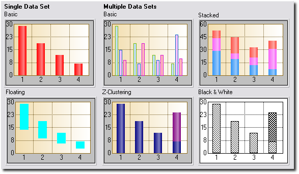
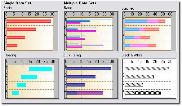
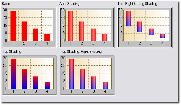
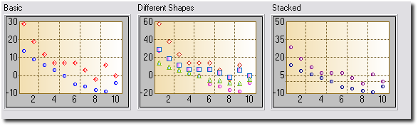
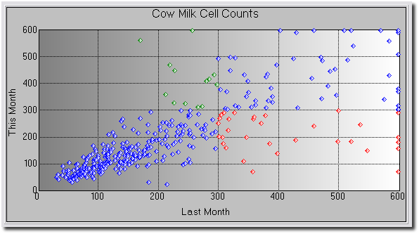
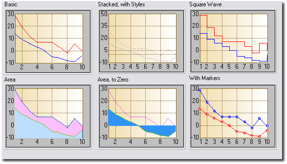
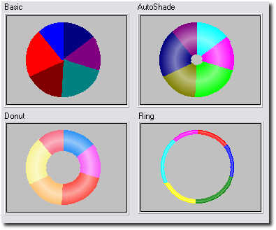
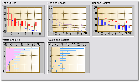
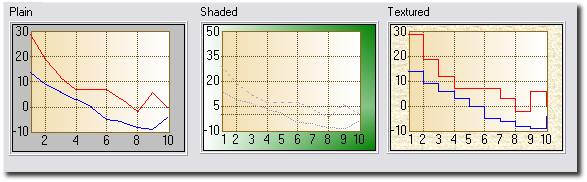
Graph Gallery
Adding Insight to your Application
Adding Insight to your Application is easy.
- Open your application and click on the Global Button.
- Click on Extensions, and add the Activate Insight Global Extension.
- You don't have to set any of the values, the defaults will all be
fine. When you want to, read up on the Global
Template Settings to see all the power you have.
Adding an Insight Graph to a Window
The hardest part of adding the Graph is deciding on
what exactly the Graph is going to show. In other words the data is
probably right there in the dictionary, but you need to get the
relationship right in your mind first. After that it's easy.
- Go to the Window Editor
- Either
Click on the Populate menu and select Control Template, and then
choose the Insight Graphing Control.
Or
Place a Region Control on the screen. When asked, select Insight Graph
for the region.
- Go to Actions for the control. Set the various graph properties
here. There will appear to be quite a lot to do at first glance, but
after you've done a couple it will get easier.
Remember, the interface is dynamic - as you get the hang of it go back
to the global extension and increase the Template
Interface Level in order to see more options.
A complete list of all the settings, and what they all do, can be
found in Options
for the Insight Graph Control Template.
Adding an Insight Graph to a Report
Printing Insight Graphs on reports is supported. There
is however a problem. Due to the nature of report writing in Clarion it is
likely that you've either
a.
used the
standard report templates,
b.
used a 3rd
party report template, or
c.
hand-coded the report
yourself.
In addition to this, the placement of graphs on a report will obviously
differ greatly from one report to the next. We have therefore tried to
make the template for placing a graph on a report as flexible as possible.
Using the Standard Report
Templates
If you are using the standard report templates, we
recommend the following steps for adding a graph to your report:
- Make a new report band.
- Give the band a name (for example, Graph) and a use equate (for
example ?Graph).
- Populate the Insight Control Template onto the band. Set the size
of the graph as you wish.
- Select from the default options for the graph (Print at Beginning
of Report, Print at End of Report, Other).
- Set the filter for the band. To do this, close the report editor,
click on the Report Properties Button, tab across to the Filters Tab
and select the filter for the Graph Tab.
Tip: If you selected Print at Beginning or Print at End, set the filter
to 1=2. This will ensure that the report template does not trigger the
graph. Instead, the graph template will trigger itself.
Tip: If you selected Other then enter
the appropriate filter here. If you want to trigger the graph yourself
by hand-coding then set the filter to 1=2.
Using some other 3rd Party
Report Template
The Insight Template generates four different bits of code for the
report. The first is the View (or Views) for the object, along with the
object definition. This is done in the Data Section of the template.
The second consists of any overriding methods that may be required by
the template.
The third and fourth pieces are generated together in the Procedure
Routines Section. You need to call the first routine to initialize the
graph. This is done just after the
open(report)command.
You can simply call the routine in the appropriate place, for example:
open(report)
do InitThisGraph1
The second routine actually reads the data from the file or queue and
prints the graph for you. You call it by simply adding the lines
do DrawThisGraph1
do PrintThisGraph1
where you want the graph to print.
If you have multiple graphs on the same detail, you will need to call
the drawing routine for each of them individually before calling the
printing routine for the last one. Calling the printing routines for the
other graphs is not necessary. For example, your code would look
something like this:
DO DrawThisGraph1
DO DrawThisGraph2
DO PrintThisGraph2
Last, but not least, be sure to kill the graphs when the report closes
to avoid memory leaks:
DO KillThisGraph1
DO KillThisGraph2
Tip: The InsightCPCS example shipped with Insight shows how to add an
Insight graph to a CPCS report.
Hand-Coding The Report Yourself
You can add the necessary code to your report by hand as well. The
easiest way to do this is as follows:
- Create a basic report and populate it as described in Using
the Standard Report Templates.
- Cut & Paste the code from the generated report into the
hand-coded report. This code will consist of two (possibly three)
sections.
- Section 1: The object declaration and
associated Views.
- Section 2: The procedure routines
(DrawGraph, PrintGraph and InitGraph).
- Section 3: (may not be there) The new
methods for the Graph object. These methods only exist if you have
set certain options, so if you can't find them, don't worry.
Examples
All the
Examples Shipped with Insight include
examples of putting graphs onto reports.
Examples
The examples shipped with Insight can be found in the
\Clarion?\3rdparty\Examples\Insight directory
(where \Clarion? is your Clarion 5.5 or Clarion 6 directory). The Clarion
7 and Clarion 8 installs prompt you during the install on where to place
the Examples.
Examples include:
- ABC: A single EXE based on the ABC
templates. See \ABC\School.app.
- Legacy: A single EXE based on the Legacy
templates. See \Legacy\School.app.
Intermediate Level Graphs : Making your Graph
Interactive
Now that you've got a graph on your window, you can
start getting really creative. This section assumes that your
Template
Level is set to Intermediate or higher.
Mouse Click Actions
The Mouse Click tab lets you set the default action for the Left-Mouse
click and also the possible actions for the Right-Click menu. Most of the
items need little explanation. See the
Mouse
Click Tab section of the Insight Template Guide for more information
on how to implement these options.
- Zoom In: Allows you to zoom in on the
graph.
- Zoom Out: Zoom out on the graph.
- Cycle Sets: Rotates the order of the data
sets on the graph. Use this if you want to bring a specific set to the
front of the graph.
- Drill Down: This allows you to drill down
to another graph. The idea is that you can create multiple graphs at
the same place in the window, with all of them except the top one
hidden. As you drill down, the current graph is hidden and the new
graph is displayed. The useful thing here is that the data displayed
by the graph you are drilling down to can be made to depend on the
point of the top graph last clicked on. See Setting
Up a Drill Down/Back Up Sequence.
- Graph Type: Allows the end user to change
the type of the graph.
- Remember Graph Type: Save the last-chosen
graph type for this graph in the INI file and restore it the next time
this application is opened.
- Copy: Copy the graph to the windows
clipboard.
- Save As... : Allows the graph to be saved
as a BMP or PNG file.
- Print Graph: Prints the graph on the
current printer.
Mouse Move Actions
As the mouse moves over the graph it is often nice to be able to see the
values of either the current mouse position (line graphs) or the item
under the mouse (bar and pie graphs). This information can then be
displayed on either the status bar, window caption, in the tip, or on a
control elsewhere on the window.
Tip: Only those sets which have a set
name will appear in the values list. To suppress a set, make sure its set
name to blank.
For more information on implementing the mouse over actions, see the
section on the
Mouse
Move Tab in the Insight Template Guide.
Intermediate Level Graphs: Mutiple Y-Axies
You may want each of your data sets to have its own
y-axis. The end-result would look something like this:
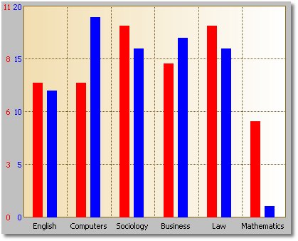
Doing this in Insight is easy:
- Make sure your Global
Template Level is on level Intermediate or higher.
- Go to the Y-Axis
Tab and tick the Use a Separate Y-Axis for each Set checkbox.
- Go to the Y-Axis
Tab for each Set, and adjust the settings there.
Intermediate Level Graphs: Setting Up a
Drill Down/Back Up Sequence
Insight has an exciting new feature allowing you drill
down from one graph to another.
Say, for example, that you had a bar graph representing the total sales of
the twelve departments in your store. Suppose also that you can break down
the sales of each department into several smaller categories, depending on
the department. Suppose now that right-clicking on a bar and choosing
Drill Down makes the graph display the sales break-down for the department
to which the bar belongs. Insight makes this possible in just a few easy
steps.
- Add a graph to your application and configure it to display the data
of the top graph - lets call this the Level 0 graph (displaying the
total sales of each department in your store). Suppose its formal name
is ThisGraph0.
- Now add a second graph over the first, and make sure that this
region is invisible - lets call this the Level 1 graph. Suppose its
formal name is ThisGraph1.
- Configure the second graph to display the relevant data - we will
fill in the filter on the data below.
- Note that for each graph with name ThisGraphN
in your application, the template automatically creates the following
local variables:
ThisGraphN:ClickedOnPointName string(255)
ThisGraphN:ClickedOnPointNumber real
ThisGraphN:ClickedOnPointName contains the
point name of the point on which you last clicked on ThisGraphN. ThisGraphN:ClickedOnPointNumber works
similarly.
- Now Set up the Filter on the Primary
Source Tab of the Level1 Graph by making use of the ThisGraph0:ClickedOnPointName
and ThisGraph0:ClickedOnPointNumber
local variables. If, for example, MySource1:DepartmentName
holds the department name for the data to be displayed by ThisGraph1,
then you could set the filter to be MySource1:DepartmentName
= ThisGraph0:ClickedOnPointName to get the desired result.
The DrillOnStores procedure (the Stores menu item on the Specific
Configurations menu) of the
Included
School Example has implemented the above steps to give you a working
example.
Advanced Level Graphs: International
Language / Translation Support
Note: The
Template
Level on the global extension has to be set to
Advanced
for you to make use of this feature.
Insight makes it possible for you to translate the right-click menu
options to any language of your choice. To do this, go to the Global
Extension, and then to the
Global
Advanced Tab. Enter the text you would like to be displayed as your
menu options here. Note that if you are entering a fixed value then you
must use quotes. You are also allowed to use variables here.
Advanced Level Graphs: Manually
Printing Screen Graphs
Note: The
Template
Level on the global extension has to be set to
Advanced
for you to make use of this feature.
There are 3 ways to make a graph appear on paper at the printer. The first
is to make a report with a graph on it (See
Adding
Graphs
to Reports). The second is to use the "right-click" Print feature
(See the the section on
Mouse Click Actions
above). The third is to call the
PrintGraph()
method. The SetReportProperties() method has been supplied to be used in
conjunction with this method call.
The PrintGraph() method takes four parameters. The syntax is:
PrintGraph (
string
DeviceName,
long
ProgramerId=
0,
long Width=
220,
long Height=
170)
The
DeviceName is the name of the printer
you would like to print the graph. If blank, the graph is sent to the
current default printer. The
ProgrammerId
is there purely for the benefit of the programmer (it comes in handy if
you use the SetReportProperties method, discussed in a moment.) The
Width and
Height
parameters set the width and height of the graph control on the page.
The SetReportProperties() method is called from inside
PrintGraph()(after
the internal report structure is opened). SetReportProperties() is there
to allow you to set additional report properties (for example the paper
size, report orientation, and so on) before the internal report is printed
by
PrintGraph(). The
code to do this can just be embedded in SetReportProperties(). The syntax
for the method is:
SetReportProperties (
long
ProgrammerID)
In your embed code you'll have access to the
ProgrammerID.
This is the same number as was passed to the
PrintGraph()
method. This allows you to have multiple behaviors in the
SetReportProperties() method. Note that the right-click Print option calls
this method with a
ProgrammerID of
255.
To generate this method so that you can embed your own code in it, go to
Actions of the graph control, and then to the
Advanced
Tab. Tick the option named Generate SetReportProperties on. Then use
the embeditor to add any code you'd like.
Examples:
ThisGraph1.PrintGraph('')
ThisGraph1.PrintGraph('
Laser
Series Printer')
ThisGraph1.PrintGraph('',
1,
100,
100)
Tip: The
GraphSales
procedure in the Insight School Example
(\clarion?\3rdparty\examples\insight\abc\school.app) has a print button
that uses these techniques.
Advanced Level Graphs: Adding to the Available
Fonts List
Note: The
Template
Level on the global extension has to be set to
Advanced
for you to make use of this feature.
There is the danger when working with fonts that the font your program
requires will not be present on the end-user's computer. Therefore,
instead of presenting you with a list of all the fonts available on your
computer in the templates, we present a subset consisting of the most
common fonts. These include Arial, MS Sans Serif, Times New Roman, and so
on.
There are however cases where you would want to add a font to this list.
For example, you may need to use a font which supports a different
character set, or you may want to use your favourite exotic font.
Fortunately, we have a way for you to do this.
To add fonts to the available list, follow the two easy steps below:
- Using Notepad (or any other text file editor), create a file called
Fonts.Ini in the \Clarion?\3rdparty\Bin
directory.
- Inside this file put a list of the fonts you would like to include.
Note that this file isn't actually an INI file, so section headings,
etc. are not required. Your file might look something like this:
Verdana
Tahoma
Comic Sans Ms
Note that the items in this list are added
to the standard Insight list, so you don't have to add the standard ones
here too. You only have to add your new special ones.
Tip: Please remember - you need to enter
the name of the font exactly as it appears in Windows. And also remember,
if you use an exotic font, then you need to make sure it is on your
customer's machine as well.
Advanced Level Graphs: Using a Variable
Number of Sets
Note: The
Template
Level on the global extension has to be set to
Advanced
for you to make use of this feature.
Consider the following graph:
You have a Invoicing type program where the different products are broken
up into departments. The number of departments and their names are set by
the user and can vary from site to site.
Now you want to graph the total sales for each month of the year, but you
want to include all the departments on the graph as different sets.
Clearly, the number of departments in this example will vary, and up to
now we have only seen how to define the sets in the template. Insight does
however cater for this phenomenon of a variable number of data sets, and
setting this up is actually quite easy.
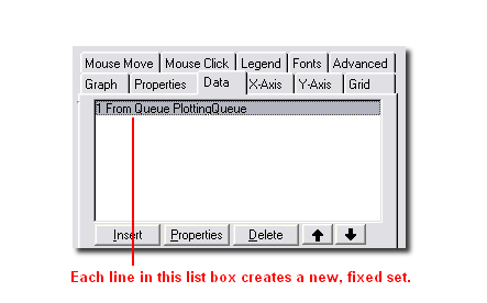
Before continuing, let's review the existing methods for creating graphs
with a fixed number of sets. First, you can add multiple entries to the
Data Tab. That would
look something like this:
You can also create multiple entries on the
Sets
Tab:
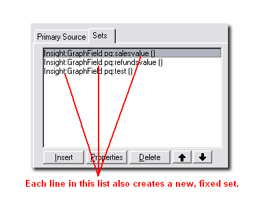
Using filters and ranges it is possible to create a fixed number of sets,
and it's easy to put the data in the right set.
In the case of a variable number of sets, though, the secret is to create
just one set, and then to use the
Override
Set Number facility on the
Advanced
Tab:
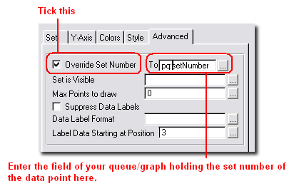
By setting the Set Number explicitly to a variable or expression, you can
send the data to different (and a variable number of) sets.
Note that all Sum, Average and Count functions should work fine, even in a
variable set environment, and even if the the data is not ordered.
For a more detailed example on how to implement this, see the
JumpStart
section in this document. The source code is available in your
c:\clarion?\3rdparty\examples\insight\jumpstart
folder.
Advanced Level Graphs: Drawing on your Graph
Some users find it useful to be able to draw their own
shapes and write their own text on the graph area. With Insight this is
possible by making use of some
low-level
drawing methods.
To start drawing on your graph, you first need to make sure that your
Global Template Level
is set to Advanced. Now go to the
Advanced
Tab of your Insight control, and tick the
Generate
Draw() checkbox. This tells the Insight template to generate the
.DrawGraph() method.
All you need to do now is to embed the code needed to display the objects
and text you want on your graph in the
.DrawGraph()
method,
after the parent call. Make sure you call
.Display().
after adding all the text and objects to your graph, as otherwise your
changes will not reflect onscreen.
Note that if your desire is to draw horizontal or vertical lines on your
graph, one or two calls to
.AddSpecialAxis()
may accomplish what you need. Note that this method does not fall under
the low-level drawing methods, though. Here, you only need to make your
calls to
.AddSpecialAxis()
followed by a call to
.DrawGraph()
at an appropriate place in your code.
An example illustrating the use of the low-level drawing methods can be
found in the
included school
example - see the PreDrawn window under the Advanced menu.
How to Know When to Use a Pie Graph
We thought it might be worth mentioning some tips and
tricks regarding how best to represent your data, especially with respect
to pie graphs.
Firstly, a pie graph is expected to have around six slices. If there are
many more slices, it is usually because there are a number of very small
slices. In the latter case, it is advisable that these get combined to
form one slice labeled "Other". Doing this will not only make the pie
chart easier to understand, but the labels for the pie slices will also
have more space and will therefore be more legible.
Another thing we also recommend is that you order your pie slices from
largest to smallest . Again, this will impart more information to the
reader by making the slices more easily comparable.
Playing around with certain pie properties, such as
PieAngle
and
PieLabelLines,
may also improve the way your graph looks to some extent. For example,
Insight tries its best to calculate the optimum number of lines over which
the data label for each pie slice should be spread. You might, however,
find that the graph layout improves when setting
PieLabelLines
to 2 when insight is choosing 1. In cases where the left-hand side of your
graph looks cluttered, you can also try setting
PieAngle
to merely 1 or 2 (degrees), especially if your last slice is tiny. This
will move the small slice and its label to the right, making more space
for the rest of the data labels on the left.
If none of the above suggestions make your pie chart seem any friendlier
to the eye, it may be that a pie is not the optimal representation for
your data. Bar charts are often better representations in these cases.
How to Use the Standard Windows
Colors
The good news is that Insight now supports the use of
the Standard Windows Colors. The way they have been implemented is that
the template creates a number of local variables (actually belonging to a
group) which contain these values. They are populated when a window or
report containing an insight graph is initialized. You can use them
anywhere in the Insight template or in the rest of your program in the
same way you would use the usual color equates (e.g.
COLOR:Aqua).
Note that for every insight object another such group is created.
Tip: Note that you are actually using
variables here, and not equates. Hence, In some cases, such as on the
Colors Tab of a
Given Set, it might be necessary to tick the
Use
Variables for Colors checkbox.
Note for Hand-Coders: See the
.GetWindowsColors()
method in the Insight Technical Guide.
The available colors may vary depending on the version of Windows you are
running. The names have to a large extent remained the same, except where
Clarion does not allow it - so, for example, 3DFace has become Face3D.
Assuming your Insight graph object is called
ThisGraph1,
the available colors are as follows:
ThisGraph1:Color:Scrollbar
ThisGraph1:Color:Background
ThisGraph1:Color:ActiveCaption
ThisGraph1:Color:InactiveCaption
ThisGraph1:Color:Menu
ThisGraph1:Color:Window
ThisGraph1:Color:WindowFrame
ThisGraph1:Color:MenuText
ThisGraph1:Color:WindowText
ThisGraph1:Color:CaptionText
ThisGraph1:Color:ActiveBorder
ThisGraph1:Color:InactiveBorder
ThisGraph1:Color:AppWorkSpace
ThisGraph1:Color:Highlight
ThisGraph1:Color:HighlightText
ThisGraph1:Color:BTNFace
ThisGraph1:Color:BTNShadow
ThisGraph1:Color:GrayText
ThisGraph1:Color:BTNText
ThisGraph1:Color:InactiveCaptionText
ThisGraph1:Color:BTNHighlight
ThisGraph1:Color:DKShadow3D
ThisGraph1:Color:Light3D
ThisGraph1:Color:InfoText
ThisGraph1:Color:InfoBK
ThisGraph1:Color:HotLight
ThisGraph1:Color:GradientActiveCaption
ThisGraph1:Color:GradientInactiveCaption
ThisGraph1:Color:MenuHighlight
ThisGraph1:Color:MenuBar
ThisGraph1:Color:Desktop
ThisGraph1:Color:Face3D
ThisGraph1:Color:Shadow3D
ThisGraph1:Color:Highlight3D
ThisGraph1:Color:HiLight3D
ThisGraph1:Color:BTNHiLight How to Use Insight in a Multi-DLL Application
Simply make sure you add the Insight Global Extension
to every DLL, program or anything else that makes use of Insight Graphing.
Filters
Filtering data on the graph is important for
performance reasons. Good filters, done in the right place, can have a
large impact on performance. This is especially true when sending a filter
to the backend database which is suitable for server-side filtering. Of
course Insight allows for the source data to be Queues and variables as
well, so filtering is also applied on the "client side".
On the template Data tab you can declare one or more Primary Sources for
the graph. Each primary source can then have one or more Sets.
The key advantage of this approach is that you can graph multiple Sets
from the same source, at the same time. In other words only one pass
through the Primary Source is required, and multiple Sets can be graphed
from that. This improves performance.
Insight lets you filter records at the Source level (on the Data / Primary
source tab) and at the Set level (on the Data / Sets tab). Set Level
filters are always applied on the client-side. Source level filters are
applied to the server-side (if the source is a File (Generated View).
Using Variables in Data-Set (Client-Side) Filters, and Data-Source
(Queue) Filters
These filters are generated as expressions. So you
can simply enter the expression into the template prompt. For example;
inv:date >= fromdate and inv:date <= todate
inv:date >= FirstOfMonth(today())
In other words, for any Data-Set filters (which are
always-client side) or Data Source filters for a Queue (which is also
always client side) you can make the filter expression as simple or as
complicated as you like.
Using Variables in Data-Source (File / Generated View) Filters
This section applies specifically to the case where
the data source is a FILE (Generated View)
It is often desirable to use a variable in a filter. For example;
inv:date >= fromdate and inv:date <= todate
This works fine as long as the variable is BINDed. If you use a local
variable, defined in the local-data pad, then the template will
automatically BIND the variable for you. If you use some other variable,
then you will need to BIND it yourself in the usual way.
You should not use BINDed functions in the Data-Source filter, as this
filter should be back-end-able. If you need to use a local function in
your filter put it into the Data-Set filter instead.
The above approach works for simple variables, which can be BINDed and
included into the expression. In some cases though the value in the
expression needs to be evaluated so that the filter can be
"constructed". An example of this is when using the result of a function
in a server-side expression. For example;
inv:date >= FirstOfMonth(today())
This filter cannot be used like this because the server cannot run the
FirstOfMonth function. But If FirstOfMonth is evaluated the server-side
filter could easily become
inv:date >= 80478
To achieve this effect a technique known as a breakout
is used. This technique imagines the filter as a string, and "breaks
out" of the string to evaluate parts of the filter.
In other words a filter entered as
inv:date >= 80478
is used in the code then the generated code looks like this;
p_v{prop:filter} = 'inv:date >= 80478'
In other words the template value is "wrapped" with quotes, and used as
a string. Understanding this the template value can become;
inv:date >= ' & FirstOfMonth(today()) &'
Which means the generated code becomes
p_v{prop:filter} = 'inv:date >= ' &
FirstOfMonth(today()) & ''
Which means the FirstOfMonth function is evaluated when constructing the
actual filter statement.
The only side-effect of using a break-out is that the filter is NOT then
repeated in the ValidateRecord method.
Common Errors
- The xxx.Exe file is linked to missing
exportyyyyy
This means that you have an old Insight DLL in the application
directory or in the path. Check your machine for C60IGX.DLL (or
C55IGX.DLL, or C5IGX.DLL, depending on your Clarion version).
- The Right-Click, Left-Click or MouseOver
functionality has stopped working.
The IMM (Immediate) attribute has been turned off on the Insight
control.
- When I try to add an Insight Graph to my window,
I get a whole lot of messages of the form "Unknown Variable
'%GlobalGridVGridColor'.
Before adding an Insight Graph to your application, make sure you have
Added the Global
Extension.
- When compiling my
application, I get errors of the form "Syntax error: Prototype is:
SETPOINTNAME(INSIGHTROOT, long)" and "Syntax error: Procedure
doesn't belong to module: THISGRAPH1.SETPOINTNAME".
This often happens when one embeds code in a procedure that appears
when the Source is being edited, but that is not actually included in
the generated source module. For the above error in particular, the
problem is solved by entering a '+' in the Point Name field on the
X-Axis Tab. For other methods, check the specific entry under the Embed Points Section of
the Technical Guide
Tips & FAQ
I have some questions about
upgrading to Insight Graphing 2
1. Clarion Versions: Insight is available for
Clarion 5, 5.5, 6.1 and 6.2. There is no upgrade charge. However, you will
need the correct installer to match the version of Clarion that you are
using. Download the correct version from
www.capesoft.com\accessories/downloads.htm#insightgraphing.
2. Does Insight use an OCX? Insight does not
make use of any external OCX or other installed component. Insight does
use a DLL containing pure Clarion code, which you can ship with your
program. See the
Distribution section.
3. Does Insight have to use the DLL, or can you make a
single EXE? Insight uses a DLL when you are compiling in
Stand-Alone mode (in this mode you are shipping Clarion Runtime DLL's as
well). If you compile in Local mode, the Insight code is linked into your
single EXE.
4. Is there any limit to the number of sets on a graph?
None, other than practical screen real-estate issues.
5. Is there any limit to the number of graphs on a
window or report? Not that we're aware of. On a window only
visible graphs are loaded and drawn, so performance is not an issue.
6. Can graphs be placed side by side on a report?
Yes. There is no limit to the number of graphs on a detail, and no limit
to the number of details containing graphs.
7.Can you add graphs to existing reports? Yes.
The template supports automatically placing graphs at the beginning or end
of the report. With a line or two of code (explained in the section on
Adding Graphs to Reports) you can put the
graph wherever you like.
8.The templates seem to imply that I need two or more
related files. What if I just want to graph points from a single file?
You can ignore the Related Files Tab.
9.The range and/or filters for the graph are not
working. If you are using your own variables (i.e. not file
fields) in the range or filter, and these variables do NOT appear on
either the Local Data button or the Global Data button, you will need to
BIND the fields yourself:
- If you are using ABC, go to the ThisWindow.Init method and for each
variable embed the code BIND('variable',variable)
- If you are using the legacy templates, go to the PrepareProcedure
routine and embed for each variable BIND('variable',variable)
10. Making your own point names: There are cases
where you will want to insert your own code for setting or formatting the
point names. For example, you might want to convert a month number (1 to
12) to a name (Jan, Feb and so on). The method for doing this is a two
step process:
- On the local extension's X-Axis
Tab, set the Point Name to + (yep, that's
just a single plus sign). This tells the template to generate the
correct embed point for you.
- Go to the Embeditor for the procedure, and look for the
SetPointName() method (it'll be right near the bottom). Enter your
code here. At this point the fields being graphed and any hot fields
are 'live'. So your code might look like this:
execute month(fil:date)
ReturnValue = 'Jan'
ReturnValue = 'Feb'
ReturnValue = 'March'
ReturnValue = 'April'
ReturnValue = 'May'
ReturnValue = 'June'
ReturnValue = 'July'
ReturnValue = 'Aug'
ReturnValue = 'Sept'
ReturnValue = 'Oct'
ReturnValue = 'Nov'
ReturnValue = 'Dec'
end
And then the generated
Return ReturnValue
11. Why are the number of x-axis grid lines less than
what is specified on the Grid Tab? On the
X-axis
Tab there is a check-box labeled
Optimize
X-ticks. If this has been checked, Insight will automatically
calculate and use the optimal number of grid lines. For the quantity
specified on the
Grid
Tab to be used, the Optimize X-ticks check-box on the X-Axis Tab has
to be unticked.
12. Why is my flat button not being
displayed as flat? Go to the
Advanced Tab of the template (the global extension must have its
Template Level set to
Advanced) and uncheck the "Enable window buffering mode" checkbox. If this
option is checked, the line of code
window{
prop:buffer} = 1 is generated and called
directly after the Insight Init() method.
13. Why does my graph take so long to load when the
window starts up? Go to the
Advanced
Tab of the template (the global extension must have its
Template
Level set to Advanced) and uncheck the "Reset graph on window reset"
checkbox. If this option is checked, the graph is reset every time the
window's Reset() method is called.
14. In my 3D pie chart with custom colors the drop
colors are not the same as the slice colors. How can I change this? The
color used by Insight to draw the drops is the Shadow Color - this is
changed on the same tab as the Fill Color that you customized (see the
Insight Control's
Colors Tab). If you leave the shadow color to
COLOR:None,
Insight will use the default colors for the drops, which explains why they
don't match up to your customized colors.
15. My report that includes an Insight graph takes
forever to produce. The problem is that the graph gets redrawn
way more times than is necessary. To prevent this, the DrawThisGraph
routine needs to be filtered out in the TakeRecord() method. To do this,
go to the Procedure Properties of the report, click on the big Report
Properties button, go to the Filters Tab, choose the Graph entry and enter
"1 = 2".
16. My Y-Axis is not being scaled as I specified.
Firstly, note that the default number of y-axis grid lines is 5 (you can
change this on the
Grid
Tab). Insight always draws the exact amount of grid lines specified.
If you specify the max (and min) value for the y-axis and the step value,
and these three values don't all line up perfectly, Insight will change
some of your specified values to allow it to draw the graph. For example,
it is impossible to draw a graph with 5 y-axis grid lines, a max value of
50, a min value of 0 and a step value of 15, and Insight will modify at
least one of these values before drawing the graph. Note that using
multiple y-axies complicates this further, because all the y-axies must
have the same number of grid lines.
17. When there is an x-axis point with no data values
plotted at that point, Insight just leaves it out. I want to see every
x-axis point, even if there is no data for it. You need to
specify the point numbers (and names) yourself. If you don't, Insight will
do this for you automatically and this will result in empty x-axis points
being ignored. To do this, go to the
X-Axis
Tab and fill in the
Point
Number (and
Point Name)
(untick Automatically Generate).
18. How can I change my graph header at run time? Embed
the code
self.
headername
= ' New Header Name'
in the ThisGraph.Reset() method. Note that, if you have set the
Graph
Heading in the template, the code for the header is also generated
in the ThisGraph.Reset() method. Therefore, either make sure you leave the
heading in the template blank, or embed the above line of code after the
parent call.
19. At a given x-axis point, how do you make sure all
the bars touch each other? Set the
Point
Width on the
Set
Tab to 100.
20. I have four numeric variables I want to plot on a
pie chart, but it only shows the first variable - the pie is one big red
circle. What am I doing wrong? There are two things you need to
make sure of when using variables to plot your pie graph: Firstly, make
sure you have filled in the Point Name and Point Number for each variable
on the
X-Axis Tab
of the Set Window - note that this is NOT the main X-Axis Tab.
Because you are using variables, and since these tend to be single-valued,
Insight does not know which point on the x-axis to plot the value in the
variable for. For the first variable you can fill in 1, for the second 2,
and so on. Then you must also make sure Insight knows that all the values
in these variables belong to the same set - by design, a pie graph
consists of slices that are points belonging to a single set. To do this,
for each variable go to the
Advanced
Tab of the Set Window (make sure the
Template
Level is set to Advanced on the global extension), click
Override
Set Number, and fill in 1.
21. I have a variable number of data sets in my graph.
However, when there are just one or two sets present, all of the data
sets are still listed in the legend and point summaries. What
happens is that the legend and point summaries use the data sets that have
nonempty set descriptions. Every time the graph is reset, the sets are not
cleared or deleted, as this would result in all the information you have
saved regarding the sets being deleted, e.g. the color, pattern, y-axis
information, data-label formats, etc. If you are not concerned with this
information, you could use the
.ClearSetQ()
to delete all the sets.
The safer option is to embed in the .
Reset
method, before the parent call, code that calls
.SetSetDescription(Set, '') for each Set. For example, the code
will look something like this:
set(Graduates)
loop until Access:Graduates.next()
self.setsetDescription(Graduates.year, '')
end
The sets appearing in the graph will have their descriptions added by the
parent call, so you need not worry about that. For a working example, see
Variable Sets under the Specific Configurations menu in the
included
School Example.
22. Why does my pareto graph not have the same number
of x-axis grid lines as specified on the Grid Tab? On the
X-Axis
Tab, if
Optimise
X-Ticks is on, Insight will calculate the optimum number of x-axis
grid lines and ignore the number specified on the Grid Tab.
23. I would like to add a note to my graph giving a
more detailed explanation of its contents. How can I do this?
Make sure that your
Global
Template Level is set to Advanced. Then go to the
Advanced
Tab of your graph and tick the
Generate
Draw() option on. Then go to the embeds of your graph control and
insert code that resembles the following in After the Parent Call:
self.SetFont('Arial', 12, font:bold, Color:White,
0)
self.Show(x, y, 'SampleText', 0)
self.Display()
See also the PreDrawn window of the
included
School Example, and the
SetFont(),
Show() and
Display()
methods.
24. Is there any chance of adding a horizontal scroll
bar to my graph? Go to the
Properties
Tab of your graph. You will see there are two General Properties,
WorkSpaceWidth and WorkSpaceHeight. Set these properties to the width and
height you would like your graph area to be. If these are larger than the
dimensions of the graph region you have put down, scroll bars will appear
where necessary.
25. Is there a way to add extra horizontal and vertical
lines to my graph? Use
AddSpecialAxis().
26. How can I get rid of the grid lines on my graph?
Go to the
Grid Tab
and enter 1 for the quantity.
27. The data label nearest to the left edge of my graph
is not being displayed. There is not enough space for the label
to be displayed without writing over the y-axis. You will probably find
that, on a graph like this, the rest of the data labels are overwriting
each other and the bars/lines/etc. The best solution is to go to the
Fonts
Tab, double click on the Data Labels entry and change the Font Angle
to 90.
28. In my line graph, if I override the default colors,
the line color changes but the legend retains the shape color. Besides
the Line Color, you also need to change the Fill Color (see the
Colors
Tab of each set). You will see that if you have shapes at the data
points of your graph, they are colored using the Fill Color. Similarly,
the colored blocks in the legend are colored using the Fill Color.
29. I have filled in two data sources on the Data Tab,
but only the sets of the first data source are being graphed. You
more than likely have filled in the fields for the x-axis point numbers
and point names on the
X-Axis
Tab using a field from one of your queues or files entered on the
Data Tab. This will be
problematic if the other file or queue gets the point numbers for its data
from a different place (probably from a field in this same file or queue).
In this case, what you need to do is tick the
Each
Set has its own Point Names and Numbers check box on the X-Axis Tab
and then go to the
X-Axis
Tab on the Set Window for each set and fill in the point name and
number for each individual set there.
30. I named a trial app I was doing Insight.app. This
generated an error when compiling: missing procedure Draw(Insight). The
insight graphing class file is called insight.clw - so by creating a
insight.app, this will mean the default name is insight.clw - hence the
name clash. Rename your app to something else.
31. How do I change the colours and styles of points in
a Total/Average/Count graph based on the current parent field?
Note that a point gets drawn only when the parent field changes, i.e. the
parent field will already have its next value by the time the point gets
drawn. Hence, if you want to use the value of the parent field in your
condition, you need to compensate for this. If your parent field
increments by 1 every time, this can be done by using ParentField - 1 in
the condition. Otherwise you will need to save the value of the previous
parent field in a variable or in your queue/data source and use that in
the condition.
Programmers Corner: Labels
It may happen that you one day decide that you want to
do some fancy tricks with the x-axis, y-axis and data labels. The aim of
this section is to give you more information on how these work in Insight.
Label information is stored in the
LabelQ
property. The
LabelQ is a queue with the
following declaration:
LabelQ QUEUE
Type LONG
Set LONG
Point LONG
DisplayText STRING(
50)
DisplayText2 STRING(
50)
DisplayText3 STRING(
50)
OriginalText STRING(
50)
X LONG
Y LONG
W LONG
H LONG
StartAngle REAL
EndAngle REAL
END
The
LabelQ stores all the labels
including y-axis labels (
Type=1), x-axis
labels (
Type=2) and data labels (
Type=3).
A specific Queue entry can be located using the
.GetLabel()
method. The
LabelQ is cleared completely
by the
.Reset() method.
Y-axis labels are cleared and recalculated by the
.DrawGraph()
method. Therefore these labels cannot easily be overridden.
Data labels are not usually stored in the queue. However, if a data label
does exist in the queue it will override the calculated label.
The
.DrawGraph() method
ultimately causes the labels to be drawn on the graph by calling
.LabelAxis() (which is responsible for drawing x- and y-axis labels - it
calls .LabelXAxis() and .LabelYAxis() to create the labels and then
positions them), .DrawDataLabels() (which is responsible for drawing the
data labels) and .LabelPieData() (which is responsible for drawing the
labels on a pie chart).