General Tab
The main purpose of this tab is for you to choose
the Template Level of your graphs.
Disable All Insight graphing Features
Click on the option to temporarily remove all Insight Graphs from your
application, and to prevent the Insight DLL from linking into your
program. This option is typically used when you are unable to compile,
or run, your program because of an Insight problem. Clicking on this
button will not lose any of your graph settings.
Multi-DLL Tab
This is paer of a Multi-DLL Program
Tick this on if this app is part of a suite of apps making up one
program.
Export Insight Classes from this DLL
Thick this on if this specific app will compile, and export, the Insight
classes. This is usually only turned on in the "root" or "data" dll, and
leaft off in all the other apps in the set.
Basic Tab
This tab allows you to set some basic global
defaults relating to line widths, 3D depths and shading.
Line Widths and Depth
This allows you to set the default Line Width for each Graph Type.
Depth for 3D
This allows you to set the default 3D Depth for each graph type.
Disable Auto Shading
Click this on if you want to disable shading throughout the whole
application. This includes the shading of bars, and also the shading of
the BackWall.
Legend Tab
Use this tab to set the global defaults for the
legend of your graphs.
Show Legends
If you click this on then legends will be displayed on all graphs by
default. The legend can then be disabled for an individual graph.
Position
Set the default position of the legend for all graphs.
Layout Shape
If this is set to "Stacked", the legends of all the graphs will be
stacked vertically. If this is set to "Inline", the legends will be
placed side-by-side to fill the line.
Font
Set the Name, Size, Color and Style of the default font to use when
creating legends. Click on the Vertical option to have the text printed
vertically instead of horizontally.
Grid Tab
This tab allows you to set all the Grid related
properties.
Use Grid Style
Insight comes with 20 different built-in Grid styles. If you prefer to
make your own style then set this option to 0 (which will make it
blank), and the rest of the options on this tab will be enabled.
Back Wall Shaded
If Auto-Shading is on, then by default the back walls of the axis system
will be shaded. Switch this option off to suppress this feature on a
global level
X-Axis Grid Lines
This allows you to set the Width, Color and Style of the X-Axis Grid
Lines. It also allows you to set the default quantity. Note that the
x-axis (the line with the x-axis labels) is not counted towards the
quantity of grid lines.
Y-Axis Grid Lines
This allows you to set the Width, Color and Style of the Y-Axis Grid
Lines. It also allows you to set the default quantity. Note that the
y-axis (the line with the y-axis labels) is not counted towards the
quantity of grid lines.
Back Wall Color
This lets you set the Line and Fill color for the back wall of the
graph. In a 2D graph this is the background color. In a 3D graph it
forms the back wall. This block also contains a setting called
Line
Width. This allows you to set the width of the lines that
surround the graph. This setting will apply to the back wall, as well as
the side and base walls if they exist.
Side Wall Color (3D Only)
These settings only apply to 3D graphs. They set the left hand side wall
Line Color and Fill Color.
Base Wall Color (3D Only)
These settings only apply to 3D graphs. They set the base wall Line
Color and Fill Color.
Fonts Tab
This Tab lets you set all the Font related
properties. There are 6 different fonts that you can set. These are:
Graph Header
This is the heading that appears at the top of the graph.
X-Axis Name
This is the name of the X-Axis that appears under the X-Axis labels.
X-Axis Labels
These are the labels that appear under the X-Axis. Typically these are
values related to the data being graphed.
Y-Axis Name
This is the name of the Y-Axis which appears to the left of the Y-Axis
Labels.
Y-Axis Labels
These are the labels which appear just to the left of the Y-Axis.
Typically these are the values of the data being plotted.
Data Labels
These are labels that appear on the graph itself, next to the plotted
points.
Colors Tab
The colors set on this tab are the colors used by
the data on the graph. For example, you would set the colors of the bars
in a bar graph, or the colors of the lines in a line graph, here.
Use Data Style
Allows you to select one of the built-in data styles.
Overrides
If you set the Data Style to 0 (which will make it blank), you can
create your own color-scheme for each data set using the list box. For
each color-scheme you will need to enter the Pen Color, Fill Color and
Shadow Color.
Translation Tab
Use this to set the default wording for the
Right-Click popup menu items. This is designed primarily for users who
are using a language other than English in their programs
Classes Tab
This tab allows you to inspect, or refresh, the
Insight classes in the app.
Graph Tab
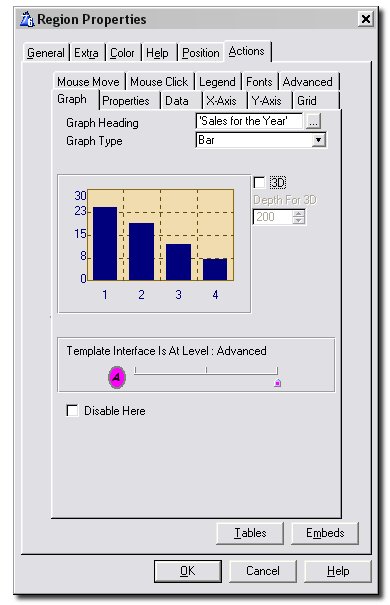
- Graph
Heading: This is the heading that appears at the top of the
graph. Enter a fixed value here (in quotes), or a variable, or an
expression.
- Graph Type: This is where you specify the
type of graph that you want to plot. Current choices include Bar,
Scatter, Line and Pie graphs.
- Where On Report: This only appears if the
procedure is a Report. The options are Beginning, End and Other. Set
the option to Beginning to put the graph at the beginning of the
report, End to have it at the end, and other to hand-code it's
placement. See Adding Graphs to Reports
for more information on reports.
- 3D:
Switch this on to make the graph 3D. Untick this to make the graph 2D.
- Depth for 3D: Allows you to override the
3D depth for the graph.
Properties Tab
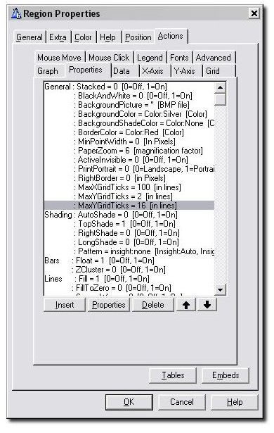
This is where you can set the general properties of your graph object.
- Stacked:
When true, this setting causes all the sets at each point to be
stacked on top of each other. For example, on a Bar graph the bars
will be stacked one on top of the other. If this is off, the bars will
all start at their specified starting point (even if that point is
behind another bar.)
- General:
BlackAndWhite: This is for if you want your graph to be
displayed in black and white only. Your bars and scatter shapes, for
example, will be filled with a black and white pattern to enable you
to distinguish between sets.
- General: BackgroundPicture: The picture
you would like to be displayed as the background for your graph.
- General: BackgroundColor: The color of
your graph's background.
- General: BackgroundShadeColor: The shade
color for your graph's background.
- General: BorderColor: The color of the
border of your graph.
- General: MinPointWidth: If you have a
large number of points on the graph, then naturally each point for the
graph is very very small. This is not terribly useful, and can also
make the graph look bad if each point is labeled. Setting this
property allows you to set the minimum space (in pixels) occupied by
each x-axis point. The graph workspace is adjusted accordingly - the
region size will remain the same, but scrollbars may appear.
- General: PaperZoom: Use this to specify
how many times higher the resolution of your graph should be when
printing it on paper than it is on the screen.
- General: ActiveInvisible: Set this to 1
if you want the graph to be loaded and processed even though it is
invisible.
- General: PrintPortrait: Set this to 1 if
you want the graph to be printed by your printer using the portrait
orientation. By default, it will be printed as landscape.
- General: RightBorder: The distance
between the right-hand-side of the graph plane (the area your graph is
drawn on) and the right edge of the graph region.
- General: MaxXGridTicks: The maximum
number of x-axis grid lines to be drawn for your graph.
- General: MaxYGridTicks: The maximum
number of y-axis grid lines to be drawn for your graph.
- General: WorkSpaceWidth: The
graph's width and height defaults to the control size on the window.
However, since Clarion supports scroll bars on a control, there may
be cases when you want the graph to be bigger than the control. In
this case, somewhere after the call to the .Init method, set the
WorkSpaceWidth and WorkSpaceHeight properties. Scroll bars will be
automatically added but OUTSIDE the space you've allocated to the
control. So if you intend to have scrollbars, make sure you have
sufficient space for them.
- General: WorkSpaceHeight: See
WorkSpaceWidth above.
- Shading: AutoShade: If
the user's computer is using more than 256 colors then the bars (on
bar charts) and background will be shaded.
- Shading: TopShade: If
this is set then Shading is from the bottom of the bar to the top.
Otherwise it is from Right to Left.
- Shading: RightShade:
This option won't work in Clarion 4. It allows bars which are
Top-Shaded to be Right Shaded as well. This can make the drawing time
quite long, so be careful when using it, but the graphs look very
good. This option is ideal for reports where a few extra drawing
seconds won't be noticed as easily.
- Shading: LongShade: This
option allows top-shaded bars to be shaded relative to the whole axis,
rather than the bar. See the temperatures graph in the School example
shipped with Insight for an example of this in action.
- Shading: Pattern:
If you want your bars or scatter- or line points to be filled
with a specific pattern, this can be specified here. This is primarily
intended for when the BlackAndWhite property has been set to true.
Note that this sets the default pattern for all sets, unless
Insight:Auto is specified. The pattern for each individual data set
can be specified on the Style Tab
for the set. The pre-defined Insight patterns include:
INSIGHT:FineDiagonal
INSIGHT:CoarseDiagonal
INSIGHT:CoarseVertical
INSIGHT:FineChecked
INSIGHT:CoarseChecked
INSIGHT:CoarseZigZag
INSIGHT:Cross
INSIGHT:Tiles
INSIGHT:CoarseHorizontal
INSIGHT:Kite
INSIGHT:CrossHatch
INSIGHT:Squares
INSIGHT:Ducks
INSIGHT:Smilies
INSIGHT:Stars
INSIGHT:Grey
INSIGHT:Waves
INSIGHT:Zigzag
INSIGHT:VeryThickZigZag
INSIGHT:Chainmail
INSIGHT:SmallVerticalZigZag
INSIGHT:Pebbles
INSIGHT:CoarsePebbles
INSIGHT:LargePebbles
INSIGHT:Mosiac
INSIGHT:LargeDots
INSIGHT:SmallDots
INSIGHT:InversedSmilies
INSIGHT:Circuits
INSIGHT:Empty
- Bars: Float: This allows for the bottom
of the bar to 'float' above the X-Axis. See Browse Temperatures in the
included School example for a good
idea of what this looks like.
- Bars: ZCluster: If
this is off then the bars (on a Bar or Pareto graph) are stacked
side-by-side next to each other. If this option is on then the graphs
are placed behind each other (not stacked on top of each other.)
- Lines: Fill: When
switched on, this option causes the area beneath the line graph to be
filled in in the color that the line was drawn. This value can be set
for each individual data set on the Set Tab.
- Lines: FillToZero: When switched on, this
option causes the area between the line graph and y = 0 to be filled
in in the color that the line was drawn. This value can be set for
each individual data set on the Set Tab.
- Lines: SquareWave: When switched on, this
causes your line graph to be drawn as a square wave. This value can be
set for each individual data set on the Set
Tab.
- Lines: StackLines:
When this is switched on, line graphs (and scatter graphs) will be
stacked if the Stacked property above is switched on. Otherwise, line
graphs wont be stacked.
- Lines: LineFromZero:
When this is switched on, the x-axis for line graphs will start at 0
instead of at 1. This can be useful if you know you want a set number
of grid lines on your x-axis and want to space the x-axis labels
accordingly using the Show
Labels at Every option.
- Pie: InnerRadius: When this has a value
greater than 0, a hole is drawn in the middle of the pie to give a
donut effect.
- Pie: MaxPieRadius: This specifies the
maximum radius your pie may have when it is drawn.
- Pie: PieAngle: Use
this to specify where you would like the first slice of your pie to be
drawn. This angle should be specified in degrees. 0 degrees is assumed
to be at 12 o'clock and the angle increases in the clockwise
direction.
- Pie: AspectRatio: For 2D pies, set this
to 1 if you want your pie to be circular as opposed to elliptical.
- Pie:
PieLabelLineColor: Use this to set the color for the lines
connecting each pie slice to its respective label.
- Pie: PieLabelLines:
The label for each slice of your pie can either be spread over one,
two or three lines. If you want to override Insight's automatic
choice, fill in either 1, 2 or 3 here. Note:
Note that there are a maximum of 3 strings that can be displayed in
the label - Name, Value
and Percent. Hence, if
you for example choose PieLabelLines to be 3 and you only have 2 of
the Name, Value
and Percent boxes
checked, there will be empty lines in the labels.
- Scatter: Shape: Use this to specify the
shape of your scatter graph's data points. Possible shapes include:
INSIGHT:None
INSIGHT:Square
INSIGHT:Diamond
INSIGHT:Circle
INSIGHT:Triangle
INSIGHT:Auto
This value can be set for each individual data set on the set's Style
Tab.
Data Tab
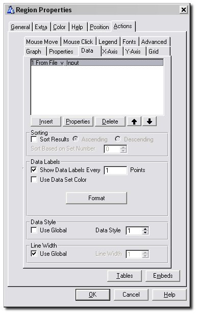
The Data Tab is where you enter all the files, queues, views and variables
you will be plotting data on the graph from. Information regarding
sorting, data labels and the style you want your data plotted in is also
entered here.
- List Box: This contains all the
information about the Data you are wanting to plot. Each entry in this
list box represents either a File, Queue, View or Memory Variable. The
different things you can set in this list are covered in the next
sub-section of this document. To get there, click on the Properties
button in the above screenshot or go to the section on the Primary Source Tab.
- Sort Results: This allows you to sort the
points along the x-axis based on their value. For example, say you had
a bar graph and wanted the bars to go from tallest to shortest. This
feature can be used to achieve this.
- Based on Set Number: This determines how
the sorting (explained in the above point) works if you have multiple
sets. If this is set to 0 then the sum of all the sets (at the same
point) is calculated, and the points on the x-axis will be sorted
according to this sum. Alternatively, if a set number is specified,
the sorting will be done according to the values inside that one set.
- Show Data Labels:
Switch this on if you want labels for the data points to appear on the
graph. Data labels normally appear at the top of a bar, near a point
on a line, near a point on a scatter graph or next to a slice of a
pie, and show the exact value for that bar, point or slice. Data
labels for individual sets can be turned off using the Suppress
Data Labels option on the Advanced
Tab of the Set Window.
- Every Point(s): (Intermediate
and Advanced Level Graphs) Allows you to display the data
labels for only some of the data points. Useful if you have a lot of
data points on the graph.
- Format: Optionally enter a Picture Format
here. This lets you, for example, easily specify numeric or financial
display pictures for your data labels. You can use the ...
button to assist you in selecting the correct picture.
- Short (Format Window): If this option is
on then the value in the data label is reduced to only 2 or 3
significant digits. For example, 123456 becomes 123K, 123456789
becomes 123M and 1234 becomes 1.2K. The unit (K, M, etc.) can also be
turned on and off (see the next point).
- Unit (Format Window): If the Short option
is on (see the point above), ticking this option causes the Unit to be
displayed behind the short number. K is for thousands, M is for millions and B
is for billions.
- Use Data Set Color: Tick this if you want
the data labels to have the same color as the set the corresponding
data points belong to.
- Value (Pie Only): Displays the value of
each slice of the Pie in the data label.
- Percent (Pie Only): Displays the value of
each slice of the Pie as a percentage of the whole in the data label.
- Name (Pie Only): Display
the name of the pie slice in the data label.
- Data Style: Use this to select a
predefined scheme that assigns colors and styles to all of the entered
data sets. Set this to 0 (blank) to use the global
Data Style (set on the Global Colors
Tab), or check the Use Global checkbox. For an individual set,
the data style and colors assigned to it by the selected scheme can be
overridden by going to the set's Colors
Tab and Style
Tab.
- Line Width: If the Use Global checkbox is
ticked, the line widths specified on the Global
Basic Tab will be used to draw the data. Untick this to specify
your own. The provided spin box can be used to override the line
widths specified on the Global Basic Tab.
Primary Source Tab
On this tab, you first make a selection from the Data From dropdown (see
the point below), and then the remaining options change according to your
selection.
- Data From: Choose one of File (Generated
View), Queue, Variable or Hand-Coded View. If the data you're wanting
to plot is in a data table (file) then select File, and if the data is
in a Queue then select Queue. If you want to plot a single point from
a memory variable then choose Variable. Lastly, if you want to build
your own View structure for reading the data then select Hand-Coded
View.
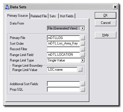
When choosing
File, your options are as
follows:
- Primary File: The name of the primary file
for this set.
- Sort Order: The name of a key. This is the
order in which the fields will be read from the file. However, see Additional Sort Fields below if you
want to order the View in a non-keyed order.
- Record Filter: If a filter is entered
here, records which don't pass the test (if the expression evaluates
to False) will be excluded from the graph.
- Range Limit Field: This field acts as the
range for the View. Records outside of the range will be ignored. Tip: Check where you can use a range
instead of a filter, as a range is
much faster.
- Range Limit Type: Specifies whether the
range is either a single value or a range of values.
- Range Limit Value, Low Limit Value, High Limit
Value: These all set the borders of your range. The latter
two options only appear if you have chosen your Range Limit Type to be
a range of values.
- Additional
Sort Fields: If you wish the view to be sorted on un-keyed
fields then use this option. However, bear in mind that this may
seriously reduce performance for some file drivers.
- Prop:SQL: This allows you to set a
Prop:SQL for the View. The command will be sent to the SQL engine
after the View is opened.
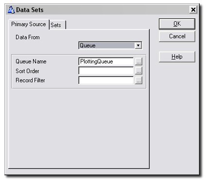
When choosing
Queue, your options are as
follows:
- Queue Name: This is the name of the Queue
itself.
- Sort Order: This field can be left blank.
Use a normal comma delimited list of Queue fields (using + for
ascending and - for descending). This will cause the Queue to be
sorted on those fields just before the Reset
method is called. Note that the Queue remains sorted after the graph
is drawn.
- Record Filter: Enter an expression here to
filter the records in the Queue. Only records that pass the test
(where the expression evaluates to true) will be included in the
graph.
When choosing
Variable, there are no options.
Move on to the
Sets Tab to specify the
variable name. Note that when you choose this option, an
extra
X-Axis Tab will appear once you get to the Set Window.
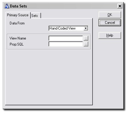
When choosing
Hand-Coded View, your options are
as follows:
- View Name: This is the name of the View
that you've written.
- Prop:SQL: This allows you to set a
Prop:SQL for the View. The command will be sent to the SQL engine
after the View is opened.
Related File Tab
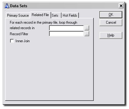
This tab is only visible if the Primary Source is a File. It allows you to
enter a file related to your primary file from which data will be graphed.
The fields of this file can, just as with the primary file, be used on the
Set Tab.
- For each record ...: Enter the name of a
related secondary file here. For each record in the primary file,
Insight will loop through related records in this file.
- Record Filter: Optionally enter a record
filter here for the specified related file.
- Inner Join: (Intermediate
and advanced Level Graphs) Allows you to make an inner join
relationship between the file and the related file. This means that if
the child does not exist then no record will be generated for the
parent.
Sets Tab
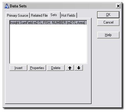
This is the tab where you specify the actual fields being plotted on the
graph. You're allowed to have multiple fields (or expressions) per File
(or Queue). Click on the
Properties button in
the above screenshot to see the tab where this information is entered, or
go to the section on the
Set Tab below.
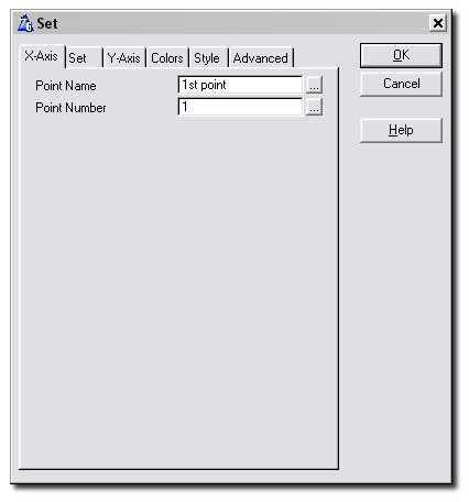
Set Window - X-Axis Tab
This tab only appears in two cases. The first is if you are using a
variable - in this case you would have chosen Variable from the
Data
From dropdown on the Primary Source Tab. The idea is, that since a
variable is single-valued, we wont know for which x-axis point the value
in that variable should be plotted. Hence, we enter these details here.
The second case where this tab will appear is if you have ticked
Sets
have own Point Name and Number Fields on the Main X-Axis Tab.
- Point Name: Enter the point name for the
x-axis point of the variable. This can be a fixed value, variable or
an expression.
- Point Number: Enter the point number for
the x-axis point of the variable. This can be a fixed value, variable
or an expression.
Set Window - Set Tab
This is where you enter all the details related to the set you want
plotted. For example, you specify which field to plot, the graph type of
this particular set and how the data should be plotted.
- Set Description: Enter the name of the
data set here. This is used for Legend
and Mouse Move
descriptions. If this field is left blank then the value for this set
will not be displayed when the mouse moves, and this set will not
appear on the legend.
- Set Type: Here you can select what graph
type you would like this particular set to be graphed as. If left on
"Default", this set will have the graph type specified on the Graph
Tab. This setting allows you to have multiple graph types
plotted on the same system of axies.
- For each Record Read: Specify here what
you would like Insight to do with every record it reads. Select from
Graph Field, Count Record, Sum Field and Average Field. The Parent
Field, Field, Value, Size and
other entries appear and are filled in according to the choice made
here.
- Graph Field: Enter the Field or
Expression that should be plotted on the Graph. With some graph
types you may be able to enter additional values. For example,
floating bar graphs have a Low value, Candle graphs have Open and
Close values, and so on.
- Count Record: Enter the Parent Field for
the counting. When the Parent Field changes, a data point with value
the total counted will be added to the Graph and the counter will be
reset to 0. The number of valid records will be counted. Note: It is
important that you sort your data according to the Parent Field for
this option to work correctly. See the Sort
Order entry on the Primary Source Tab.
- Total Field: Enter the Parent Field and
the Field (or Expression) to sum. When the Parent Field changes, a
data point having value the calculated total will be added to the
graph and the total will be reset to 0. Note: It is important that
you sort your data according to the Parent Field for this option to
work correctly. See the Sort
Order entry on the Primary Source Tab.
- Average Field: This is the same as Total
Field (see the above point), but the Field values will be averaged
rather than totaled. Note: It is important that you sort your data
according to the Parent Field for this option to work correctly. See
the Sort
Order entry on the Primary Source Tab.
- Parent Field: What you enter here depends
on your selection for "For each Record Read" above. See the
description for your particular selection above.
- Field: What you enter here depends on your
selection for "For each Record Read" above. See the description for
your particular selection above.
- Value Field: (Scatter and Pie graphs)
Enter the field that you want plotted on the scatter graph.
- Size Field: (Scatter and Pie graphs) Pies: Use this to specify a maximum size for
your pie. This is useful if you have a number of pies on the same
screen or report and want them all to be the same size. If you enter a
small enough value here this will achieve the desired effect. Scatter
Graphs: You might wish to convey some information about the
data you are graphing by the size of the individual scatter points.
Enter a field of your queue or file here that should be used to
determine the size of the data point.
- Date: (Time graphs) Enter the field that
holds the date at which the data values were collected.
- Time: (Time graphs) Enter the field that
holds the time at which the data values were collected.
- High Field: (Candle and
Hi-Lo graphs) Candles: For candle graphs, the size of the
wick is determined by the High and Low values, and the High value is
the highest point of the wick. Hi-Lo Graphs:
The size of the bar is determined by the High and Low values, and the
High value is the highest point of the bar.
- Open Field: (Candle and
Hi-Lo graphs) Candles: For candle graphs, the size of the
thicker bar is determined by the Open and Close values. Use the Conditional
Point Overrides facility on the Colors
Tab to change the color of the bar depending on whether the
price has gone up or down. Hi-Lo Graphs: The
Opening value for a hi-lo graph is displayed to the left of the bar.
- Close Field: (Candle and
Hi-Lo graphs) Candles: For candle graphs, the size of the
thicker bar is determined by the Open and Close values. Use the Conditional
Point Overrides facility on the Colors
Tab to change the color of the bar depending on whether the
price has gone up or down. Hi-Lo Graphs: The
Closing value for a hi-lo graph is displayed to the right of the bar.
- Low Field: (Candle and
Hi-Lo graphs) Candles: For candle graphs, the size of the
wick is determined by the High and Low values, and the Low value is
the lowest point of the wick. Hi-Lo Graphs:
The size of the bar is determined by the High and Low values, and the
Low value is the lowest point of the bar.
- Record Filter: You can enter an additional
filter here. This filter will only apply to this set. You can use this
to remove items from the total, average, count or graph itself.
- Lines: Square Wave: Indicate here whether,
if you chose this set to be a line graph, you want it to be drawn as a
square wave.
- Lines: Fill Area: Indicate here whether,
if you chose this set to be a line graph, you want the area below the
line graph to be filled.
- Lines: Fill to Zero: Indicate here
whether, if you chose this set to be a line graph, you want the area
between the graph and y = 0 to be filled.
- Bars: Point Width
(percent): Use this to specify how wide you would like your
bars to be. For example, if you fill in the value 66 here (the default
value), the bars of this set will be only take up 66 percent of the
space in width allocated to it. This leaves gaps between it and the
bars of other sets at the same point.
Set Window - Y-Axis Tab (For
Intermediate and Advanced Level Graphs where "Use a Separate Y-Axis for
each Set " is on)
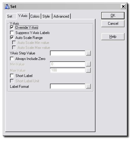
To use this window, the
Template Level on
the global
General Tab should be set to
Intermediate or Advanced, and
"Use a Separate
Y-Axis for each Set" on the main
Y-Axis
Tab should be ticked. Use this tab to specify the details for the
y-axis to be used for this set.
- Override Y-Axis: Tick this if you want
this set to have a y-axis different from the one specified on the main
Y-Axis Tab. Ticking this enables you to
fill in the rest of the options on this window.
- Suppress Y-Axis Labels: (Intermediate
and Advanced Level Graphs) Allows you to prevent the labels
on the set's Y-Axis from being drawn.
- Auto Scale Range:
Click this on if you want the Y-Axis to be scaled automatically to fit
the data being plotted. Both the Min and Max values for the Y-Axis
will be determined automatically by Insight.
- Auto Scale Min Value:
If the Auto-Scale-Range option is off, you can tick this on to allow
Insight to automatically determine the Min value for the Y-Axis while
you fix the Max value manually in the provided entry.
- Auto Scale Max Value:
If the Auto-Scale-Range option is off, you can tick this on to allow
Insight to automatically determine the Max value for the Y-Axis while
you fix the Min value manually in the provided entry.
- Always Include Zero: Tick this on if you
want Insight to always include the value y = 0 in the auto-scaled
range.
- Y-Axis Step: The
Min, Max, and all other Y-Axis labels will be a multiple of this
number. For example, entering 10 here will ensure that all Y-Axis
labels are a multiple of 10. Note that, if you specified the Min and
Max values yourself, your values will be adjusted to fit in with this
step value.
- Min Value / Max Value: Allows you to
specify the minimum and maximum values for the Y-Axis. This can be a
fixed number, a variable, or an expression.
- Short: If this option is on then each
y-axis label is reduced to only 2 or 3 significant digits. For
example, 123456 becomes 123K, 123456789 becomes 123M, 1234 becomes
1.2K and so on. The unit (K, M or B) can also be turned on and off
(see the next point).
- Short Label Unit: If the Short option is
on (see the above point), turning this option on causes the unit to be
displayed behind the short number. K is for
thousands, M is for millions and B
for billions.
- Label Format: Optionally enter a Picture
Format for the y-axis labels here. This lets you, for example, easily
specify numeric or financial display pictures for your labels. You can
use the ... button to assist you in
selecting the correct picture.
Set Window - Colors Tab (
Intermediate and and Advanced Level Graphs)
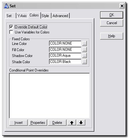
The Colors Tab is used to specify the colors used to draw the data points
in this set, including the conditional coloring of data points. Note that
this tab is only available when the
Template
Level on the global
General Tab is
set to Intermediate or Advanced.
- Override Default Color: This allows you to
override the default colors as assigned by the Use
Data Style option on the Data Tab.
These changes will apply to the whole set (if you only want to change
the color settings of some points in the set then see Conditional
Point Overrides below).
- Use Variables
for Colors: Normally you'd select fixed colors for your set,
and there is a Color Palette to help you with this. However, you may
want to use a variable, in which case you should tick this option on.
- Line Color: The color used to draw the
lines of your line graph.
- Fill Color: The color used for filling
polygons in your graph - for example, this color will be used to fill
bars, scatter shapes and the area beneath
your line graph if you have chosen to do so.
- Shadow Color: When AutoShade
is switched off, this color is used to color the side and back panels
of bars. Leave this blank to have Insight determine the best shadow
color. Tip: AutoShade
has to be turned off for you to see an effect here.
- Shade Color: This is the color used to
shade bars by TopShade, LongShade
and RightShade. Tip:
At least one of these shading options needs
to be turned on for you to see an effect.
- Highlight Intensity:
If Autoshading is on, this determines how bright the light source on
your objects should be. Should have a value between 1 and 100.
- Conditional
Point Overrides: This option allows you to override the
colors for a select group of points, based on some condition. It
allows you to highlight points on the graph that need highlighting.
All the points of this set meeting the condition you enter here will
be colored according to your specifications (all of this information
is entered after pressing the Insert Button).
Set Window - Style Tab ( Intermediate
and and Advanced Level Graphs)
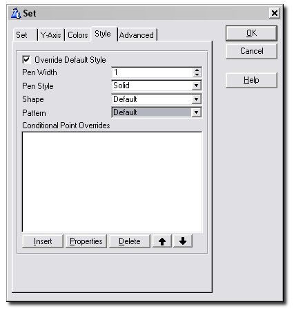
This Tab allows you to set the style used to draw your lines, scatter
shapes, bars, etc. Note that this tab is only available when the
Template
Level on the global
General Tab is
set to Intermediate or Advanced.
- Override Default Style: This allows you
to override the default style as assigned by the Use
Data Style option on the Data Tab.
These changes will apply to the whole set (if you only want to change
the style settings of some points in the set then see Conditional
Point Overrides below).
- Pen Width: The width of the pen used to
draw lines.
- Pen Style: The style of the pen used to
draw lines.
- Shape: The shape of your scatter or line
graph points. Note that, if BlackAndWhite
is turned on on the Properties Tab,
your scatter and line points will always be square.
- Conditional Point Overrides: This option
allows you to override the style for a select group of points, based
on some condition. It allows you to highlight points on the graph that
need highlighting. All the points of this set meeting the condition
you enter here will be styled according to your specifications (all of
this information is entered after pressing the Insert Button).
Set Window - Advanced Tab
(Advanced Level Graphs)
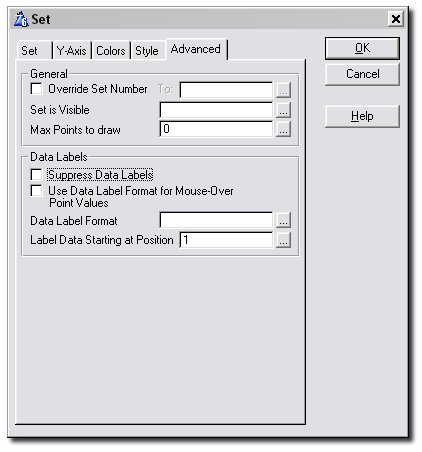
This tab contains a number of advanced options. Note that this tab is only
available when the
Template Level on the
global
General Tab is set to Advanced.
- Override Set
Number: Allows you to override the set number for this group
of points. You could give it a fixed number you particularly want it
to have, like 1, 2 or 3. The more common use for this, though, is
illustrated in the jumpstart.
The idea is to remove the need for you to enter every set separately
on the Data Tab when a data point's set
number is stored in a field of the record of the data queue or file it
belongs to. This is also useful if you want to collect data from
different places, and yet graph them all as part of one set as if they
were all stored in the same place.
- Set is Visible:
Enter a variable name or expression (which should contain or evaluate
to either 1 or 0) which determines whether this data set should be
visible on the graph or not.
- Max Points to Draw:
This is the maximum number of points of this data set Insight
will draw. Leave it at 0 if you want Insight to draw all the points in
this set.
- Suppress Data
Labels: Tick this on if you do not want the labels for the
data points in this set to be drawn even though you switched the Show
Data Labels option on the Data Tab
on.
- Use Data
Label Format for Mouse-Over Point Values: C heck this if you
want the set's Data Label Format (specified in the entry below) to be
used for displaying the point values in the set's mouse-over
information. For this set, the specified Data Label Format will be
used instead of the Point Value Format
specified on the Mouse Move Tab.
- Label
Data Starting at Position: Enter here the position of the
point on the x-axis where you want to start labeling the data of this
set, e.g. first, second or third. The main use of this is to avoid
cramming too many data labels into too small a space. For example, say
you had two sets, and you are labeling your
data points every 2 points (specified on the Data
Tab). You could enter the value 1 here for your first set, and
the value 2 for your second. Then there will only be one data label
appearing at every given x-point, and the set the data label belongs
to alternates.
- Use as Total for
100%: Tick this if you want the data to be displayed as
percentage values on the y-axis and you want this set's value at each
x-axis point to be used as the total for calculating those
percentages. If you don't want this set to be visible (typically you
wouldn't, as it will be 100% at each x-axis point), just make it
invisible.
Hot Fields Tab (Intermediate and
Advanced Level Graphs)
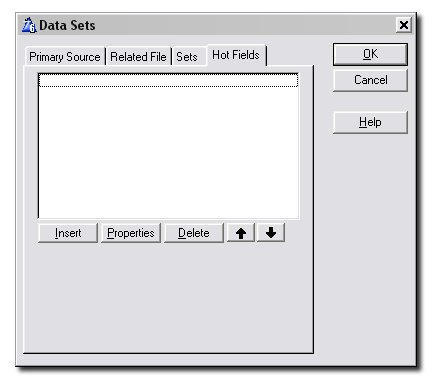
This allows you to add additional fields to the view. Note that this tab
is only available when the
Template Level on
the global
General Tab is set to
Intermediate or Advanced.
X-Axis Tab
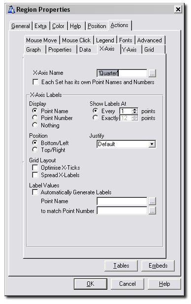
This tab lets you set all the options relating to the x-axis, including
the axis name and labeling information.
- X-Axis Name: This can be a fixed value
('in quotes') or a variable, or an expression. This is the name that
appears under the x-axis of the graph.
- Each set
has its own Point Names and Numbers: Tick this if your sets
all get the point numbers for their data from different places. For
example, if on the Data
Tab you have entered to different queues or files, you will more
than likely need to tick this option, because each of these queues or
files will contain its own field giving the point name and number for
each data point. Be sure to then go to the X-Axis
Tab on the Set Window to fill in the point name and number for
each set.
- Display: Lets you decide what to display
as labels on the x-axis. Choose one of Point Name, Point Number or
Nothing.
- Show Labels at
Every ... Points: If you set this to n, only every
n'th label will be displayed on the x-axis.
- Show Labels at Exactly ... Points: Lets
you fix the number of labels to display on the x-axis regardless of
the number of points. Insight will try its best to display this number
of points, but you may find that it will round this number up to
ensure that the x-axis labels are evenly spread.
- Position: Choose where you want the labels
for the x-axis to appear. If your x-axis is vertical, choose one of
left or right. If it is horizontal, choose one of top or bottom.
- Justify: Select how you would like your
x-axis labels to be justified. The options are default, left, right
and center. By default the labels will be right-justified.
- Optimize X-ticks: If
this is ticked on, Insight will adjust the number of x-axis grid lines
so that the maximum graph area is used. Tip:
Selecting this option causes Insight to ignore the number
of x-axis grid lines specified on the Grid
Tab.
- Spread X-labels:
When this is ticked, insight will make sure that the labels on the
x-axis are spread out evenly - in other words, it will make sure that
the all distances between any two adjacent x-labels are equal. This
may mean that the labels on the x-axis will not be the exact values
read in at the Point Name or Point
Number below.
- Automatically Generate Labels: This is the
easiest option. It automatically generates numbers to act as x-axis
labels.
- Point Name: This
allows you to enter a variable or expression which will be used as the
Point Name. Typically this is a value in the same (or related) file or
queue as the data being plotted (i.e. every record has a field for the
Point Name).
- to Match Point Number:
If you want to specify the point number (to match the Point Name),
then enter it here. Typically this is a value in the same (or related)
file or queue as the data being plotted (i.e. every record has a field
for the Point Number). If you leave this blank, the data will be
ordered in the order it is read from the file.
- Date/Time Values: Include Date in Label (Time
Graphs Only): Include the date in the X-Axis Labels. Remember
to enter a format for the date by clicking on the Format Date button.
- Date/Time Values: Include Time in Label (Time
Graphs Only): Include the time in the X-Axis Labels. Remember
to enter a format for the time by clicking on the Format Time button.
If no format is entered the time will not be displayed.
- Format Date (Format Date Window - Time Graphs
Only): For time graphs, enter the format you would like your
dates to be displayed in.
- Format Time (Format Time Window - Time Graphs
Only): For time graphs, enter the format you would like your
times values to be displayed in.
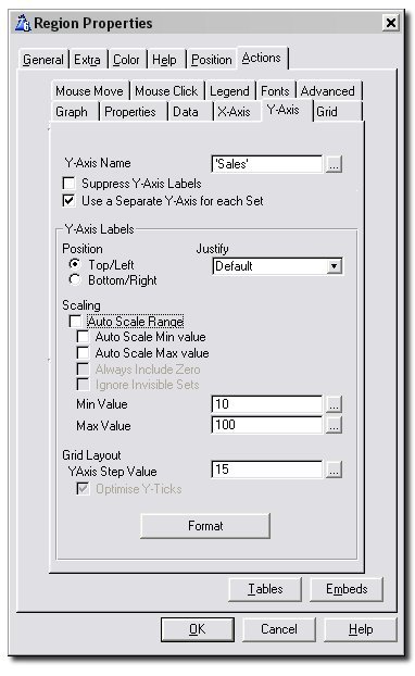
Y-Axis Tab
This tab lets you set all the options relating to the y-axis, including
the axis name and labeling information.
- Y-Axis Name: This can be a fixed value (in
single quotes), a variable, or an expression. This is the name that
appears to the left of the Y-Axis of the graph.
- Suppress Y-Axis Labels: (Intermediate
and Advanced Level Graphs) Allows you to prevent the labels
on the Y-Axis from being drawn.
- Use a separate
Y-Axis for each Set: (Intermediate and
Advanced Level Graphs) Click this to generate a different
Y-Axis for each data set. This is useful when plotting items together
which have very different values (like temperature in degrees, and
pressure in kilopascals). After ticking this, all the sets will still
be using the Y-Axis specified on this tab. To create a different
Y-Axis for a given set, you should go to the Y-Axis
Tab on the Set Window, tick Override
Y-Axis and fill in the details on that tab.
- Position: Choose where you want the labels
for the y-axis to appear. If your y-axis is vertical, choose one of
left or right. If it is horizontal, choose one of top or bottom.
- Justify: Select how you would like your
y-axis labels to be justified. The options are default, left, right
and center. By default the labels will be right-justified.
- Auto Scale Range: Click this on if you
want the Y-Axis to be scaled automatically to fit the data being
plotted. Both the Min and Max values for the Y-Axis will be determined
automatically by Insight.
- Auto Scale Min Value: If the
Auto-Scale-Range option is off, you can tick this on to allow Insight
to automatically determine the Min value for the Y-Axis while you fix
the Max value manually in the provided entry.
- Auto Scale Max Value: If the
Auto-Scale-Range option is off, you can tick this on to allow Insight
to automatically determine the Max value for the Y-Axis while you fix
the Min value manually in the provided entry.
- Always Include Zero: Tick this on if you
want Insight to always include the value y = 0 in the auto-scaled
range.
- Ignore
Invisible Sets: When auto-scaling, turn this on to prevent
Insight from using the data values in invisible sets to calculate the
Y-Axis Min and Max values.
- Y-Axis Step: The Min, Max, and all other
Y-Axis labels will be a multiple of this number. For example, entering
10 here will ensure that all Y-Axis labels are a multiple of 10. Note
that, if you specified the Min and Max values yourself, your values
will be adjusted to fit in with this step value.
- Min Value / Max Value: Allows you to
specify the minimum and maximum values for the Y-Axis. This can be a
fixed number, a variable, or an expression.
- Format: Optionally enter a Picture Format
for the y-axis labels here. This lets you, for example, easily specify
numeric or financial display pictures for your labels. You can use the
... button to assist you in selecting the
correct picture.
- Short: If this option is on then each
y-axis label is reduced to only 2 or 3 significant digits. For
example, 123456 becomes 123K, 123456789 becomes 123M, 1234 becomes
1.2K and so on. The unit (K, M or B) can also be turned on and off
(see the next point).
- Short Label Unit: If the Short
option is on (see the above point), turning this option on causes the
unit to be displayed behind the short number. K
is for thousands, M is for millions and B
for billions.
- Date/Time Values: Include Date in Label (Gantt
Graphs Only): Include the date in the Y-Axis Labels. Remember
to enter a format for the date by clicking on the Format Date button.
- Date/Time Values : Include Time in Label (Gantt
Graphs Only): Include the time in the Y-Axis Labels. Remember
to enter a format for the time by clicking on the Format Time button.
If no format is entered the time will not be displayed.
- Format Date (Format Date Window - Gantt Graphs
Only): For gantt graphs, enter the format you would like your
dates to be displayed in.
- Format Time (Format Time Window - Gantt Graphs
Only): For gantt graphs, enter the format you would like your
times values to be displayed in.
Grid Tab (Intermediate and Advanced Level
Graphs)
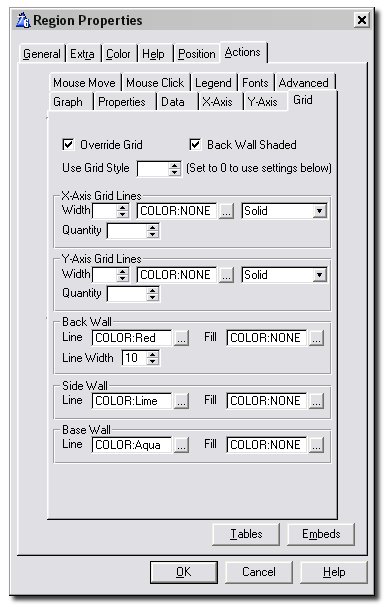
Use this tab to set the grid properties for your graph. Refer also to the
Grid Tab on the Global Extension, where you
can set the global defaults for the grid. Note that this tab is only
available when the
Template Level on the
global
General Tab is set to Intermediate
or Advanced.
- Override Grid: If you tick this on, the
Global Grid settings will be overridden for this graph. Use
Grid Style becomes enabled.
- Use Grid Style: Use
this spin box to select a predefined grid style. Set this to 0 (empty)
to enable the rest of this tab and set the grid style yourself.
- Width: Specify the width of the y- or
x-axis grid lines. Also remember to choose a color and style for the
x- and y-axis grid lines.
- Quantity:
Specify the number of x- and y-axis grid lines you would like
to appear on the graph. Note that if Optimise
X-Ticks is on on the X-Axis Tab,
Insight will ignore the number of x-axis grid lines you specify here.
Similarly for y-axis grid lines and Optimise
Y-Ticks on the Y-Axis Tab. Note:
The x-axis (the line with the x-axis labels) and y-axis (the line with
the y-axis labels) are not counted towards the quantity of grid lines.
- Line: These three entries let you specify
what the outline color of the Back, Side and Base Walls should be.
Note that the Base and Side Walls are only visible if your graph is 3D.
- Fill: These three entries let you specify
what the color of the Back, Side and Base Walls should be. Note that
the Base and Side Walls are only visible if your graph is 3D.
- Back Wall: Line Width: This can be used
to specify the line width used to outline the Back Wall. This is
mainly for use in a 2D graph where you want
the surrounding border of your graph to be thicker (or thinner).
Mouse Move Tab
(Intermediate and Advanced Level Graphs)
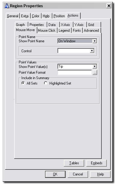
This tab is used to specify what should happen when the mouse is moved
over the graph area. Typically, you would want the point names and values
to be displayed on a tool tip or somewhere on the window. Note that this
tab is only available when the
Template Level
on the global
General Tab is set to
Intermediate or Advanced. Tip: Insight will
not
display these values for sets which do not have set names.
- Show Point Name: This lets you display the
name of the point which is currently under the mouse either as a Tool
Tip, on the Status Bar, on the Window Caption, or on some control On
the Window. If you choose On the Window you will need to put a string
(or equivalent) control on the window and specify this in the Control
entry. If you choose Status Bar you will need to specify the Status
Zone. As the mouse moves the control, status bar, tool tip or
window caption will be updated with the current point name. Tip: Not
all Clarion versions support multi-line tool tips. Don't choose tool
tip here unless you have Clarion 5b or later.
- Show Point Value(s): This does the dame
for the data point values as it does for the point names. See the
above point.
- Point Value
Format: Enter the format that you would like to use to
display the point values. If you want each set's points to be
displayed using a different format, or if you want a set's data label
format to be used for its mouse-over information, then tick the Check
Box on the Set's Advanced Tab.
- Control: If
you chose On Window for Show Point Name or Show Point Values above,
this option appears. Choose which control on the window you would like
the information displayed on.
- Status Zone:
If you chose Status Bar for Show Point Name or Show Point Values
above, this option appears. Choose the section of the status bar you
want the information to appear on.
- Include
In Summary: For the point values, you have two choices.
Either you can have the values for all the sets included in the
summary, or you can choose to only include the value for the set over
which the mouse is. Remember that sets which do not have set names
will never be included in the summary.
Mouse Click Tab (Intermediate and Advanced
Level Graphs)
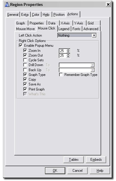
The Mouse Click Tab lets you specify what should happen when the mouse is
clicked in the graph region. Note that this tab is only available when the
Template Level on the global
General
Tab is set to Intermediate or Advanced.
- Left Click Action: This lets you set the
action which should be taken when the user clicks on the graph with
the left mouse button. Choose from Zoom In, Zoom Out, Cycle Sets,
Drill Down, Back Up, Graph Type, Save As, Print Graph and What's This.
All of these are explained below.
- Enable Popup Menu: Tick this box on to
enable the right-click popup menu for the graph. All the possible Menu
Items are listed below this check and are explained below.
- Zoom In: Allows you to zoom in on the
graph. To the right of this you need to set the percentage of zoom for
each zoom-in. For example, if this is set to 25, the graph will zoom
to 75% on the first zoom in. Then it will zoom in to 50%, and then to
25% on all subsequent zooms.
- Zoom Out: This is the opposite of zoom in
- see the above point.
- Cycle Sets: Rotates the order of the data
sets on the graph. Use this if you want to bring a specific set to the
front of the graph.
- Drill Down To: This allows you to drill
down to another graph. The idea is that you can create multiple graphs
at the same place in the window, with all of them except the top one
hidden. As you drill down, the current graph is hidden and the new
graph is displayed. All you have to do is link them together using
this setting. Enter the name of the graph you want to drill down to
next to this check box.
Tip: See the section on
Setting
Up a Drill Down/Back Up Sequence.
- Back Up To: If you are currently on a
graph that was drilled down to, this takes you back to the graph that
was drilled down from. The current graph is hidden and the new graph
is displayed. Enter the graph to back up to next to this check box.
Tip: See the section on
Setting
Up a Drill Down/Back Up Sequence.
- Graph Type: Allows the end user to change
the type of the graph.
- Remember Graph
Type: If this is ticked, Insight will remember the last
graph type selected by the user from this menu in the INI file. When
the application is started up at a later date, the graph will be
displayed in the last selected form.
- Copy: Copies the graph
to the Windows Clipboard.
- Save As... : Allows the graph to be saved
as a BMP or PNG file.
- Print Graph: Prints the graph on the
current printer.
Legend Tab (Intermediate and Advanced
Level Graphs)
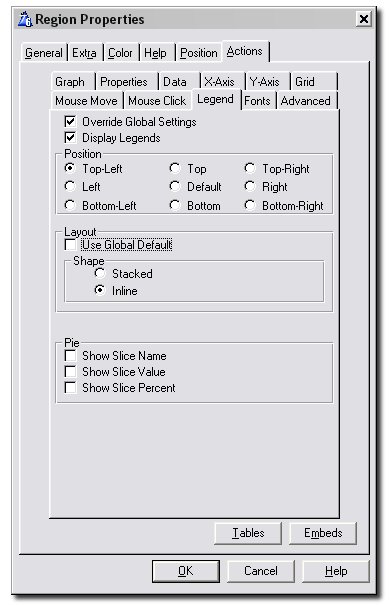
This tab is used to override the global settings for the legend specified
on the
Global Legend Tab. Note that this
tab is only available when the
Template Level
on the global
General Tab is set to
Intermediate or Advanced.
- Display Legends: If you don't want any
legends displayed for this graph, leave this checkbox unticked.
- Shape: Choose between Stacked and Inline.
If you select Stacked, the legend elements will be stacked one on top
of the other, and if you choose Inline they will be displayed one next
to the other.
- Pie: Show Slice Name, Show
Slice Value, Show Slice Percent: Select here how you would
like the slices of your pie to be represented in the legend.
Fonts Tab
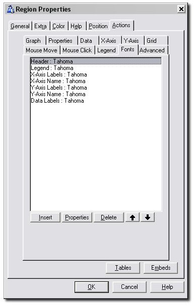
Use this tab to specify the font details of all text appearing on your
graph.
Advanced Tab (Advanced Level Graphs)
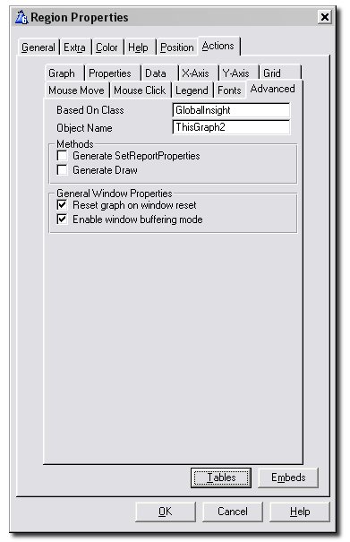
The Advanced Tab contain a medley of specialized options aimed at
optimizing performance and allowing the advanced programmer greater
flexibility. Note that this tab is only available when the
Template
Level on the global
General Tab is
set to Advanced.
- Based on Class: This defaults to
GlobalInsight, meaning that the base class specified in the Based
On Class entry on the Global Advanced Tab will be used here.
Changing this is truly for advanced users who have created their own
class based on the Insight class, and want to use their class for this
specific graph instance.
- Object Name: Allows you to enter a
developer-friendly name for the graph object.
- Generate SetReportProperties(): Tick this
on if you need to embed code in the SetReportProperties() method. For
more discussions on why you'd want this method see the section Advanced:
Manually Printing Screen Graphs.
- Generate
SetLabelFonts(): Tick this if you want to edit the font
properties of only one or two x-axis or y-axis labels to make them
stand out. See the section
on the LabelQ for more information on how to tackle this. Also
see the SetLabelFonts()
definition.
- Reset Graph on Window Reset: If this is
checked (which it is by default), the graph will be reset every time
the window's Reset() method is called. Uncheck this if your graph is
taking a very long time to load when the window opens. Note that
switching this option off affects how often your graph is refreshed
and it hence may have an impact on how promptly changes to your
graphed data is reflected. You can force your graph to reset by
calling the .Reset()
method.
- Enable window buffering mode: If this is
checked (which it is by default), the line of code window{prop:buffer}
= 1 will be called right after the graph's .Init()
method. Uncheck this if you have problems, for example, with your flat
buttons not being displayed as flat.